
.gif)
Turning a cluttered legacy site into a clear, confident luxury shopping journey. Finding great clothes shouldn’t feel like solving a puzzle.

Mainline Menswear is a long-established luxury retailer known for curating high-end menswear across all ages, styles, and occasions.
From trend-driven brands to classic labels, the company emphasises exclusivity, quality, and exceptional service. This approach delivers a refined shopping experience from the initial interaction.
Years of incremental fixes resulted in a site that felt outdated and more difficult to navigate than is acceptable for a luxury brand. Many customers expressed frustration over the layout, with some even abandoning their shopping carts due to navigation issues. Visitors found the site frustrating and unworthy of their time, which inevitably affected sales and brand perception.
As the sole designer with limited resources, I focused on addressing these critical issues. My responsibilities included enhancing the visual aesthetics, and ensuring the alignment of the user experience with contemporary UX standards. The end goal was to transform the legacy site into a premium, user-centred journey.
Year
2024
Role
Product designer
Industry
Retail, website & commerce
Brand
Mainline Menswear

Session duration
Add-to-basket conversion
Bounce rate
Homepage → product CTR


Over two decades of developer modifications and outdated insights had rendered the site busy, inconsistent, and disconnected from the expectations of modern premium menswear shoppers.
One shopper expressed their frustration clearly when they noted that, 'Navigating the site felt like wandering through a maze with no clear path.' This sentiment echoed among others, highlighting a widespread misalignment between user needs and the site's interface.
The business relied on assumptions and outdated research, leading to decisions that didn't align with customers' preferences. Consequently, the user journey became cluttered and confusing, requiring excessive effort from users who sought efficiency, clarity, and confidence.
While the brand positioned itself as a luxury retailer, the website communicated a different story. This mismatch created friction and missed opportunities before customers even reached the basket.
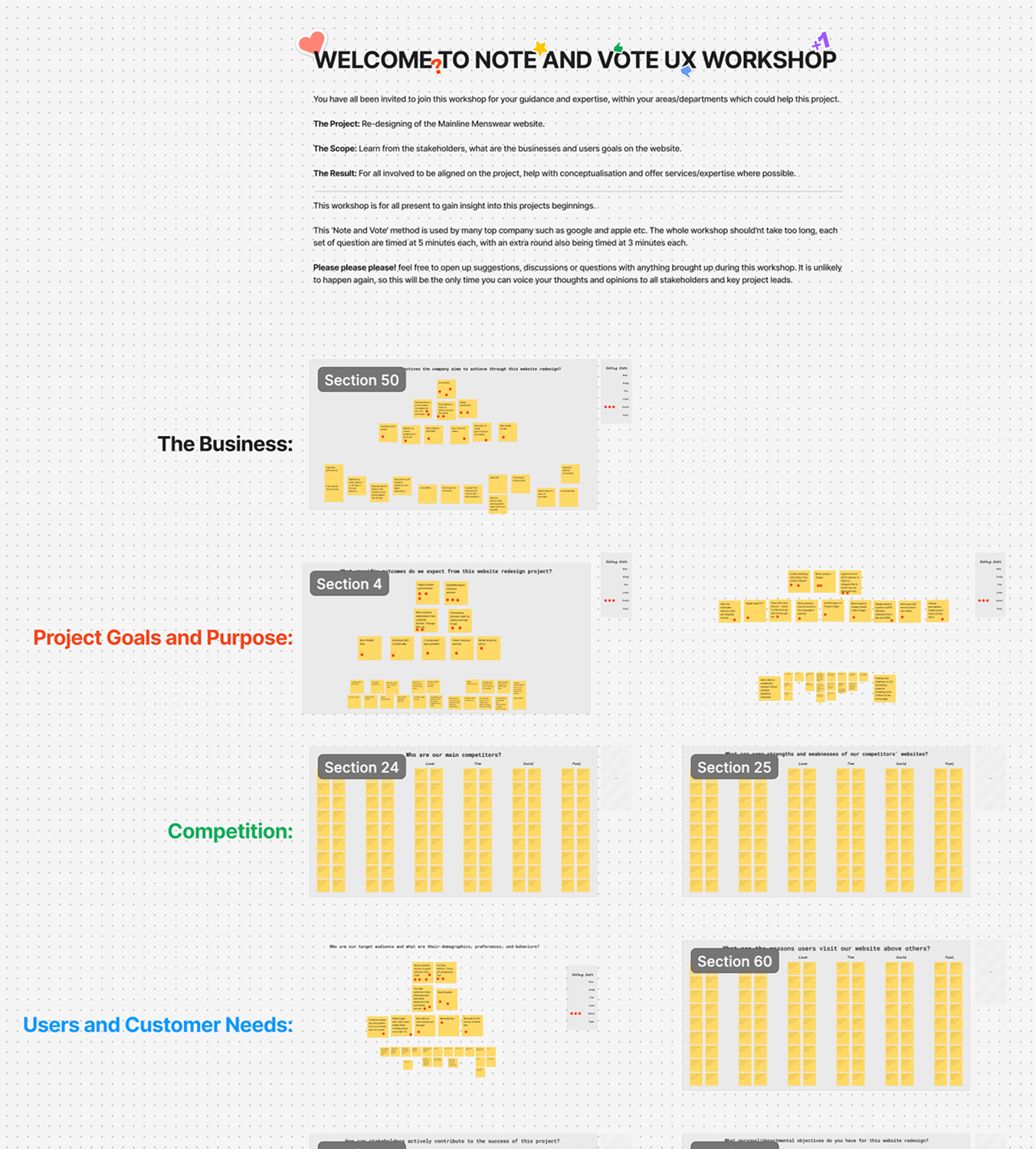
An audit confirmed that the site's experience hindered rather than supported shoppers. We conducted a comprehensive audit through evaluations and usability testing to gather insights. A review of previous UX studies, behavioral data, and customer feedback identified three recurring patterns:
1. The experience wasn’t built around real user needs
Much of the existing structure was based on internal assumptions and previous judgments. Users experienced confusion not due to a lack of skill, but because the website was shaped by individuals' priorities rather than user needs.
2. Key moments of confidence were missing
Contemporary shoppers seek immediate clarity regarding what to view, how to make selections, and which elements to trust. However, essential information was dispersed, resulting in hesitation and diminished purchasing confidence.
3. The brand and the experience were telling different stories
Although Mainline offers premium menswear, the website appeared as a collection of temporary fixes rather than a polished luxury experience. This gap reduced user engagement and hindered confident browsing.
These findings solidified the redesign, which now centres on clarity, confidence, and a premium narrative from the offset.
Years of incremental changes left the experience below the expectations of luxury shoppers. The redesign was guided by three core principles that inform all subsequent decisions.
1. Clarity over clutter
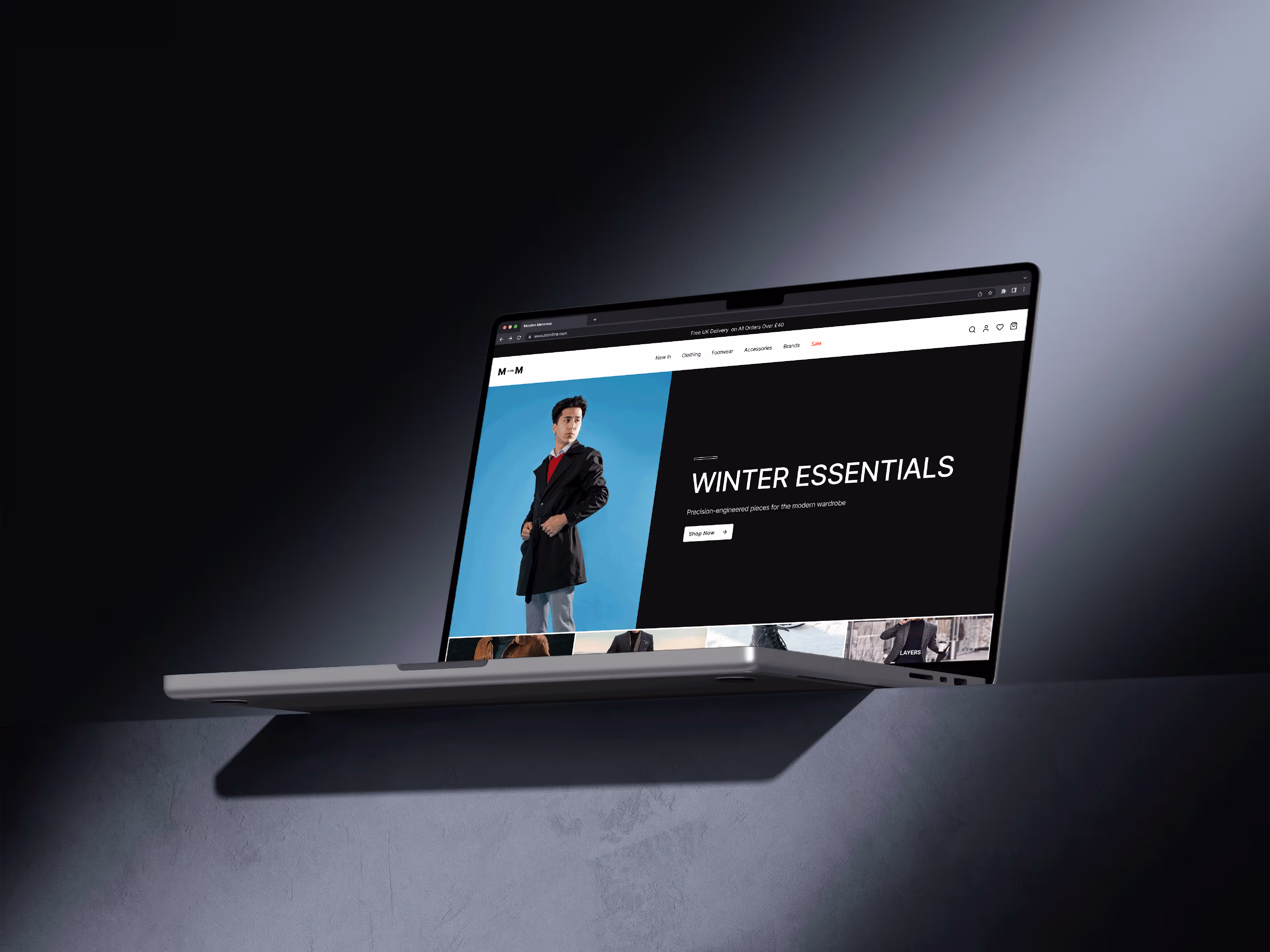
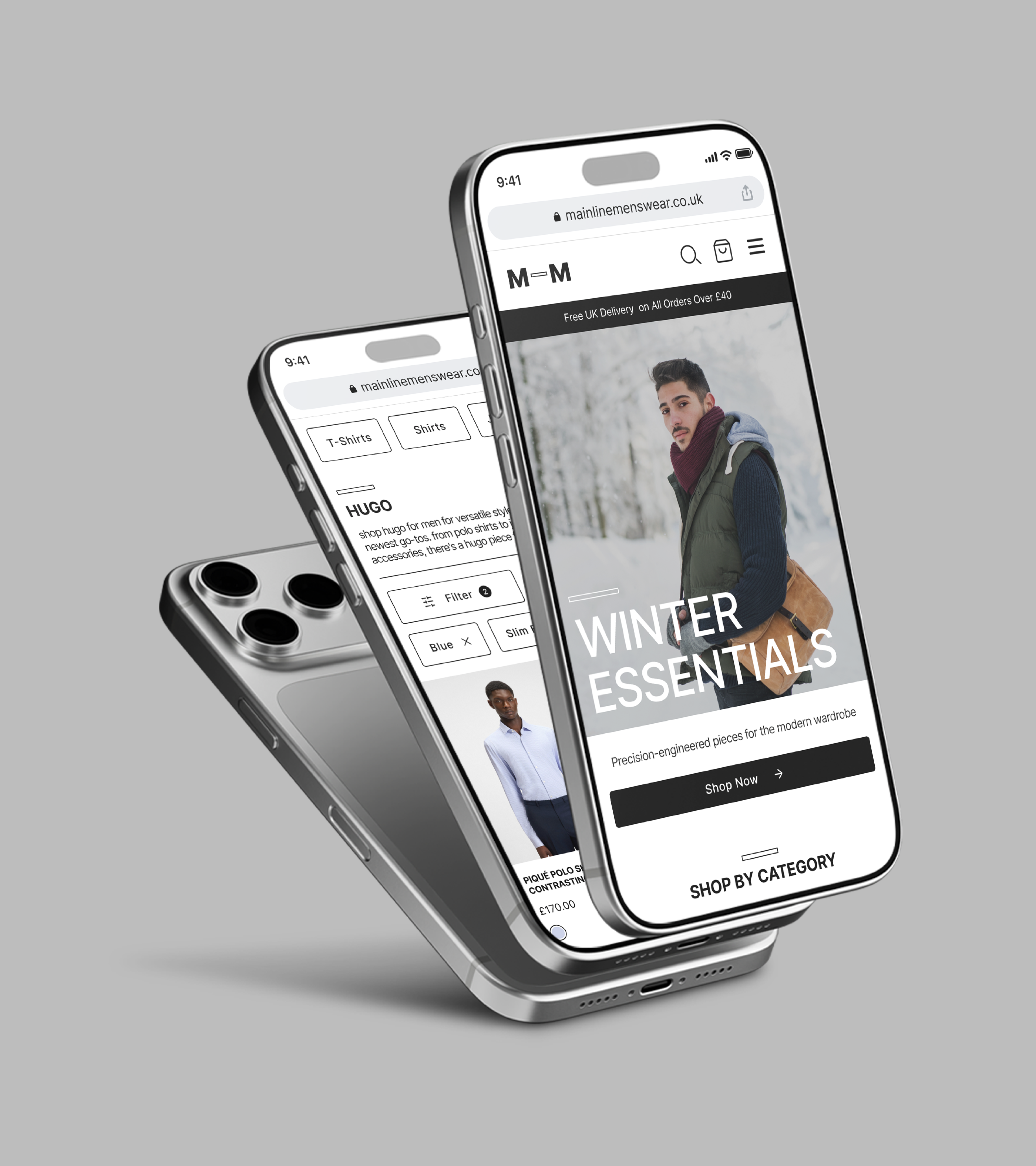
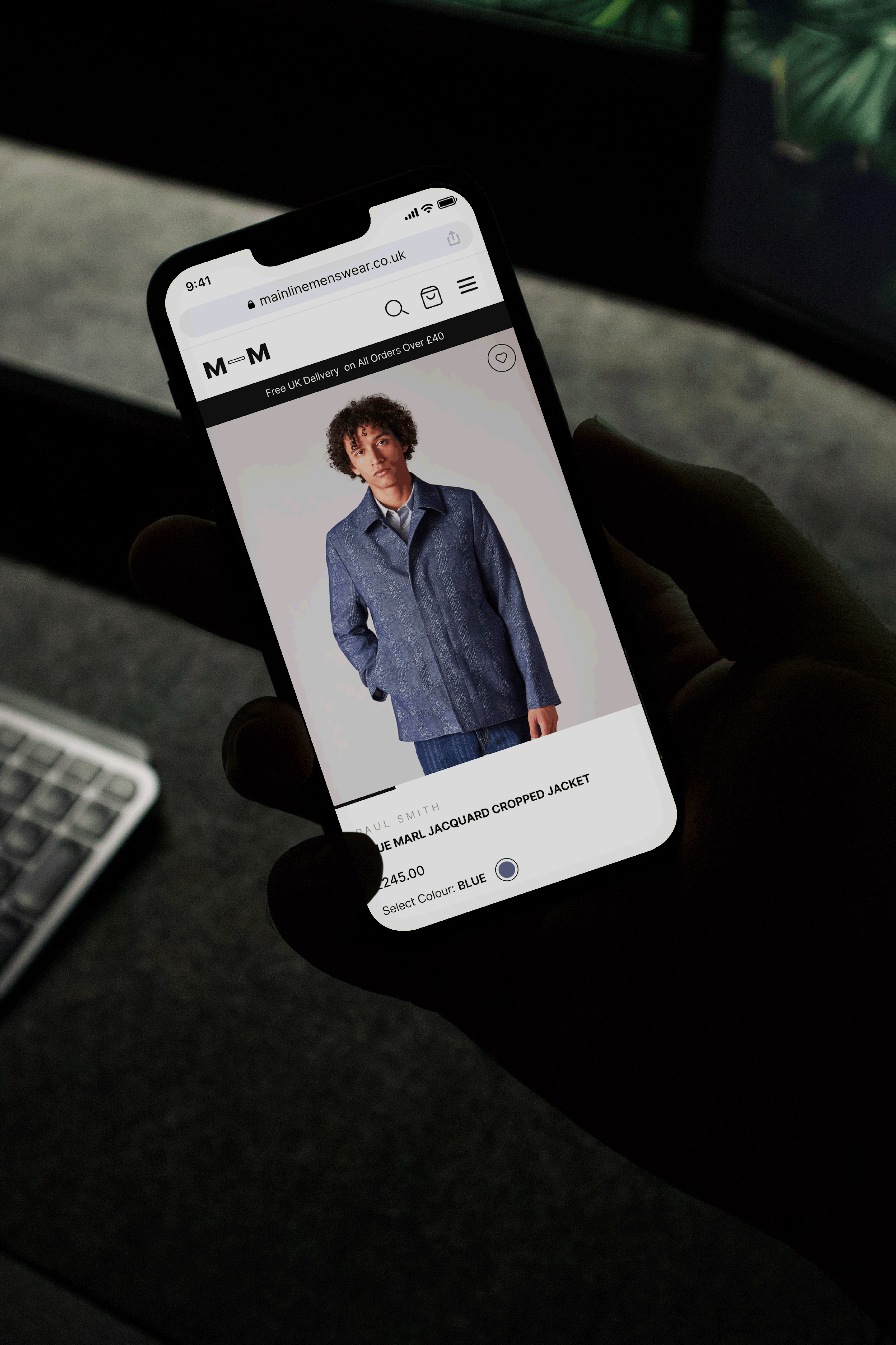
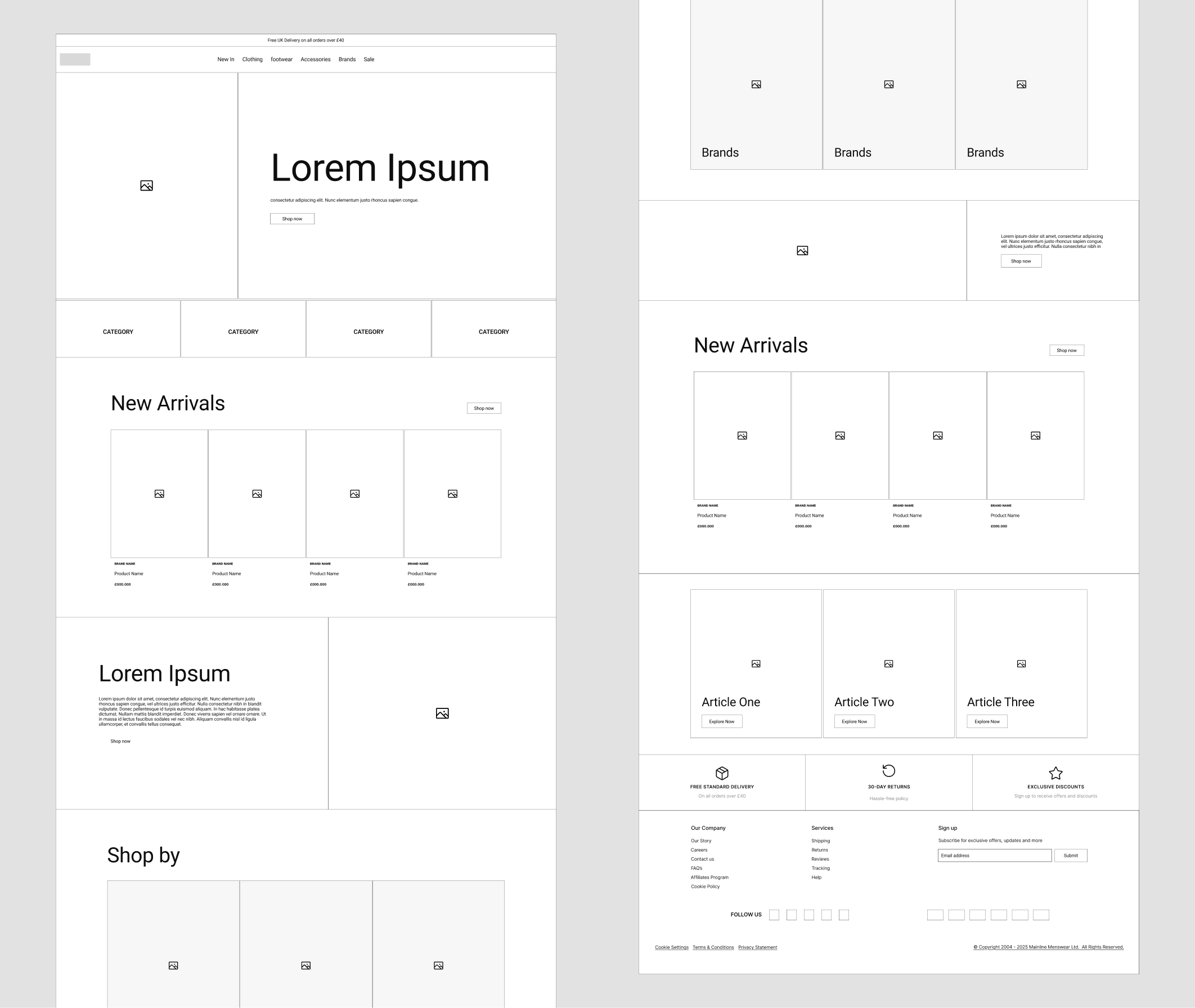
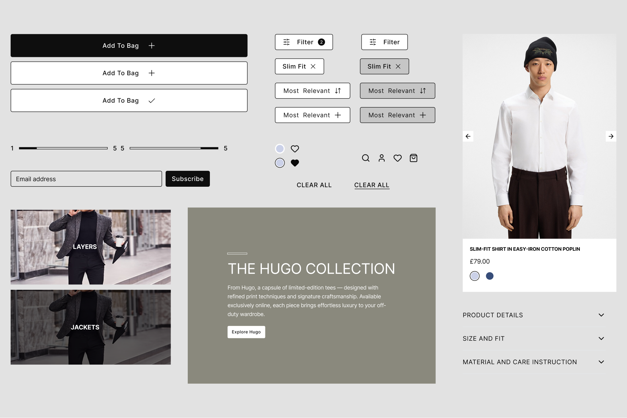
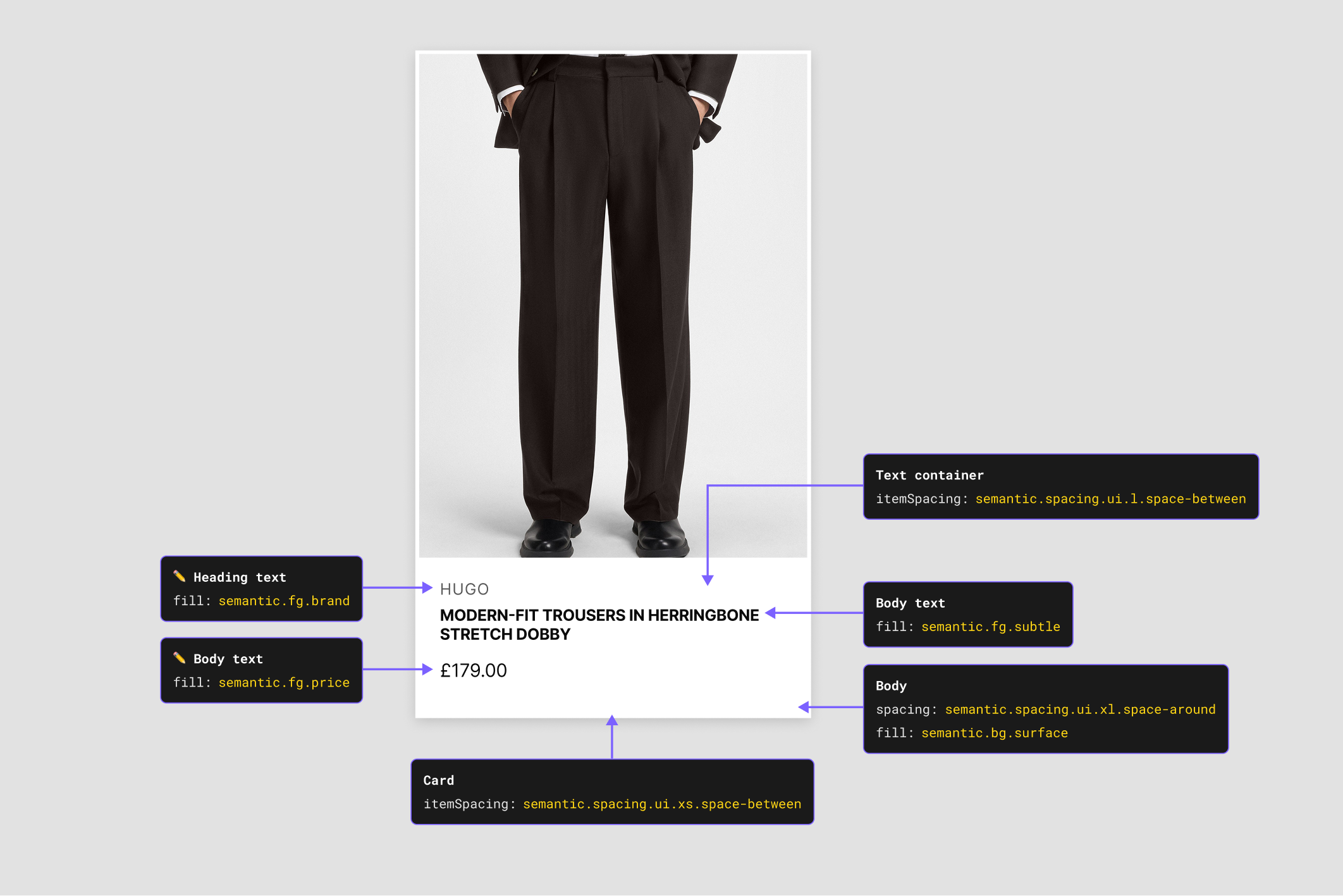
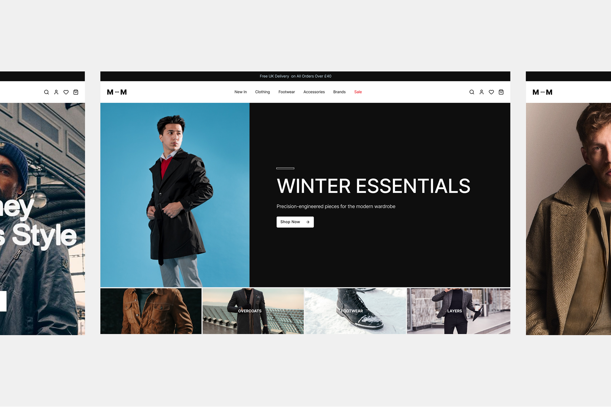
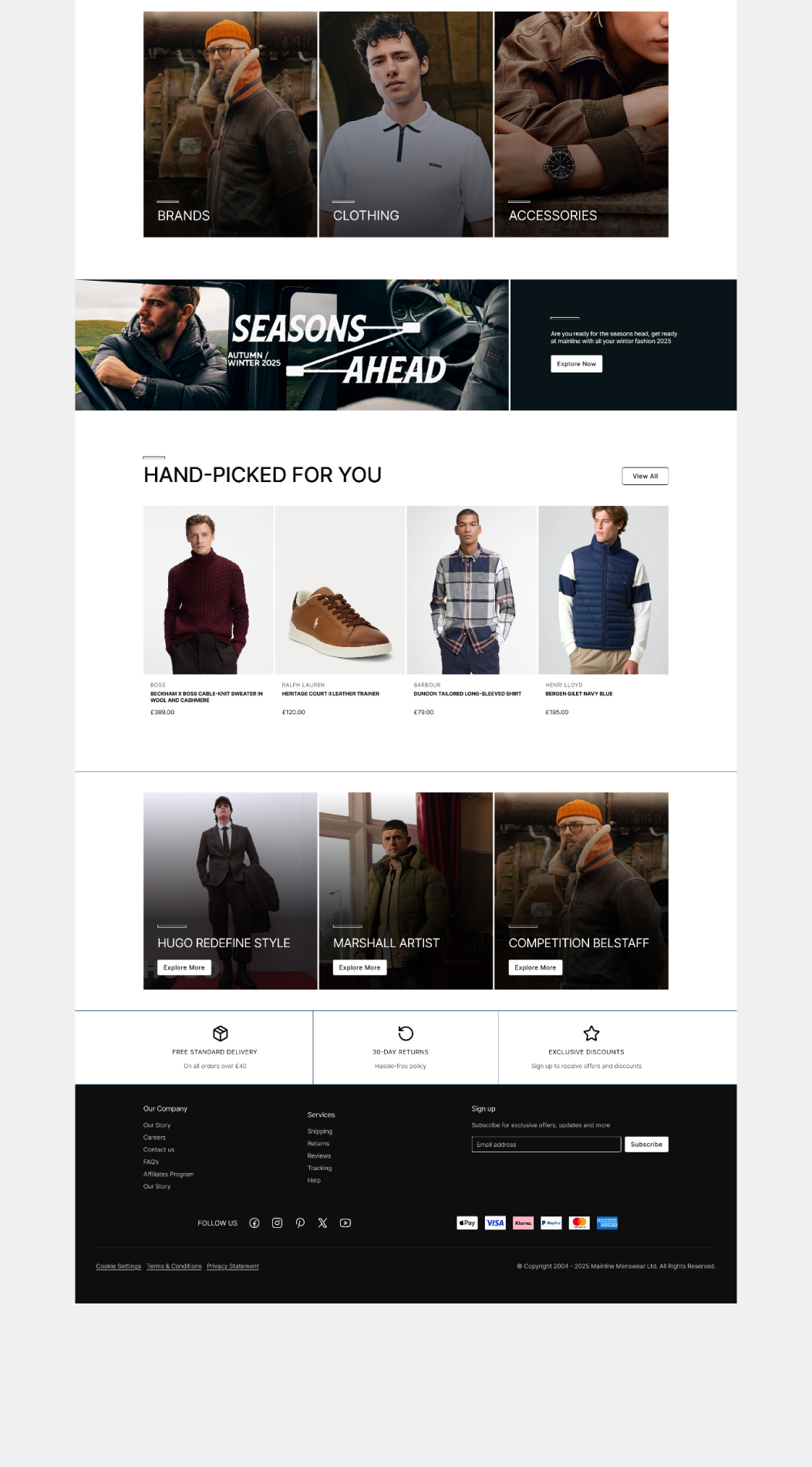
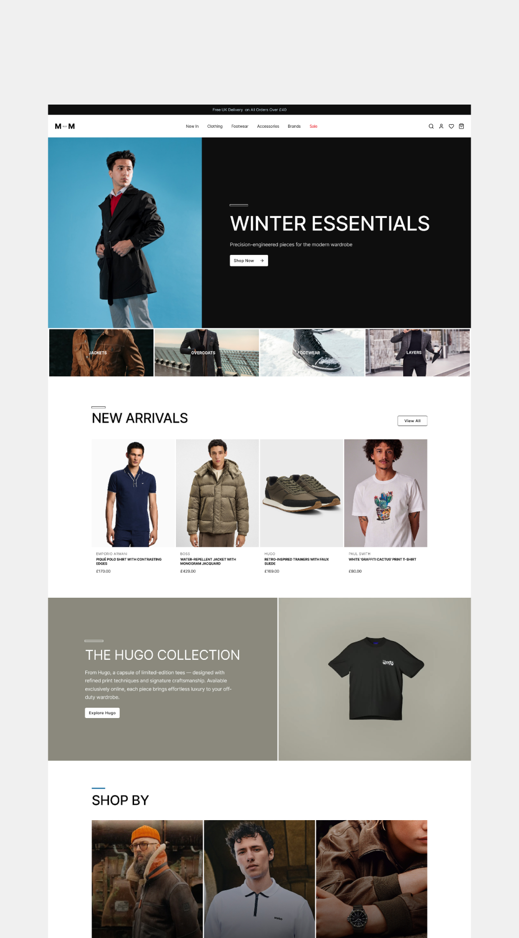
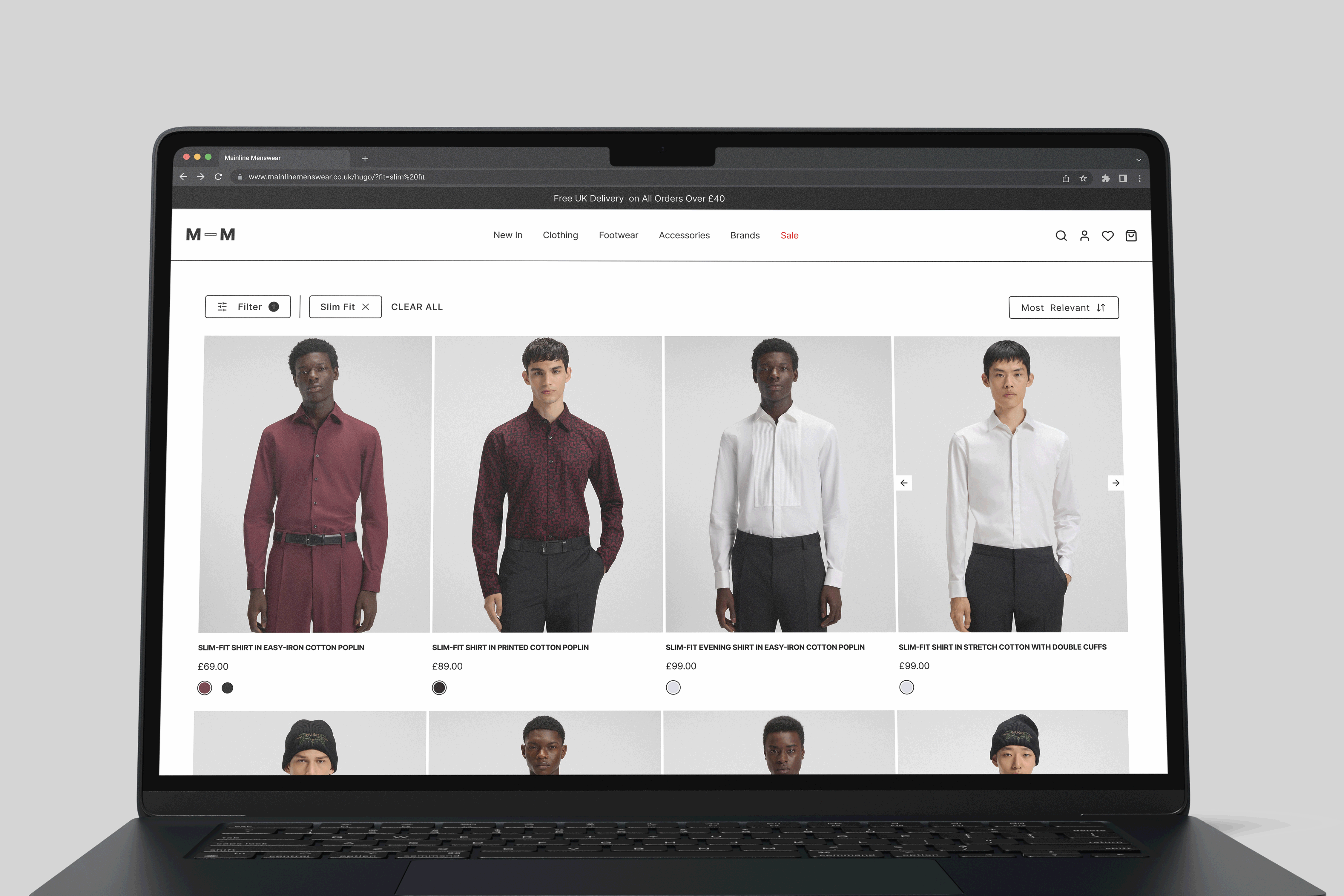
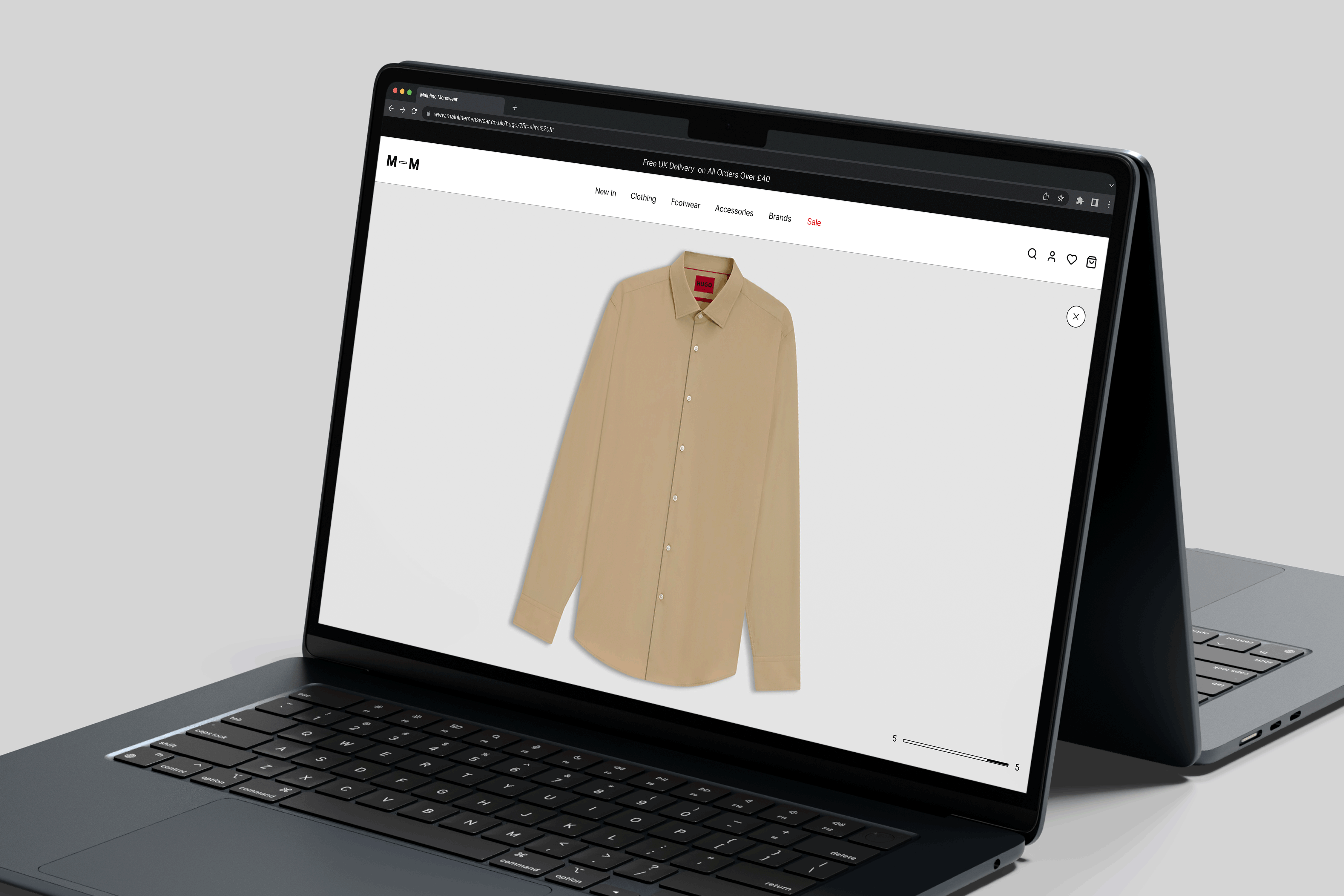
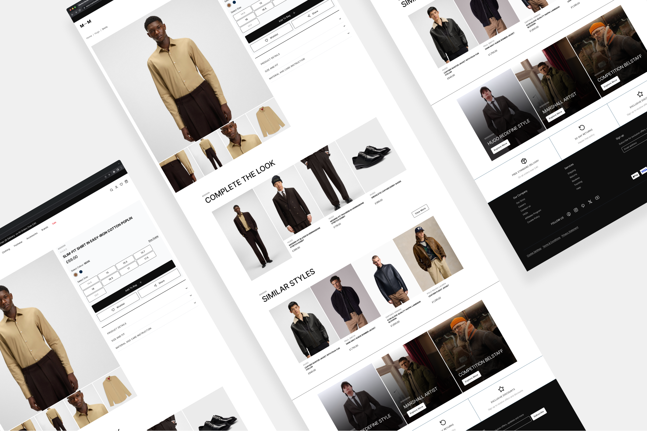
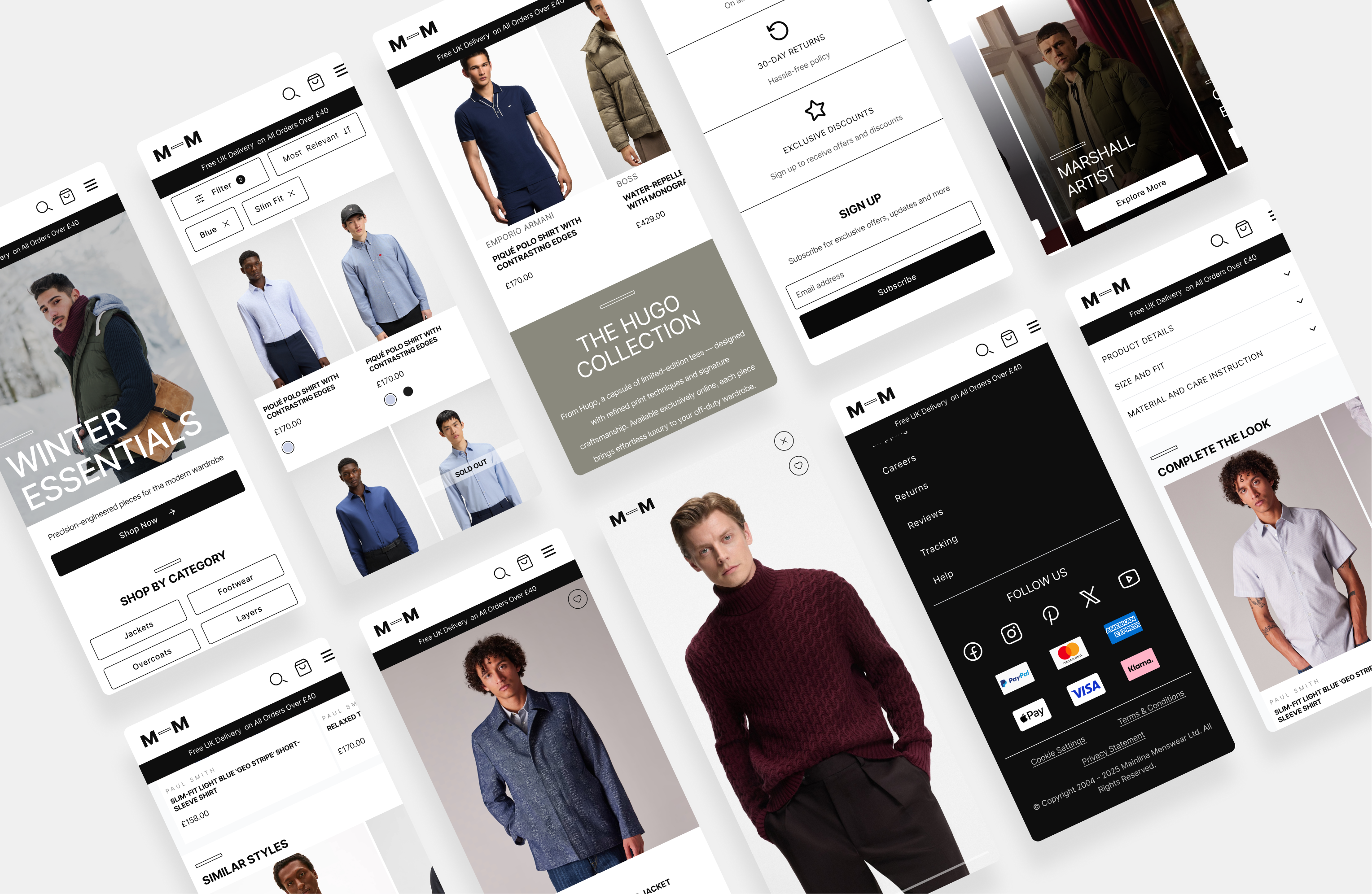
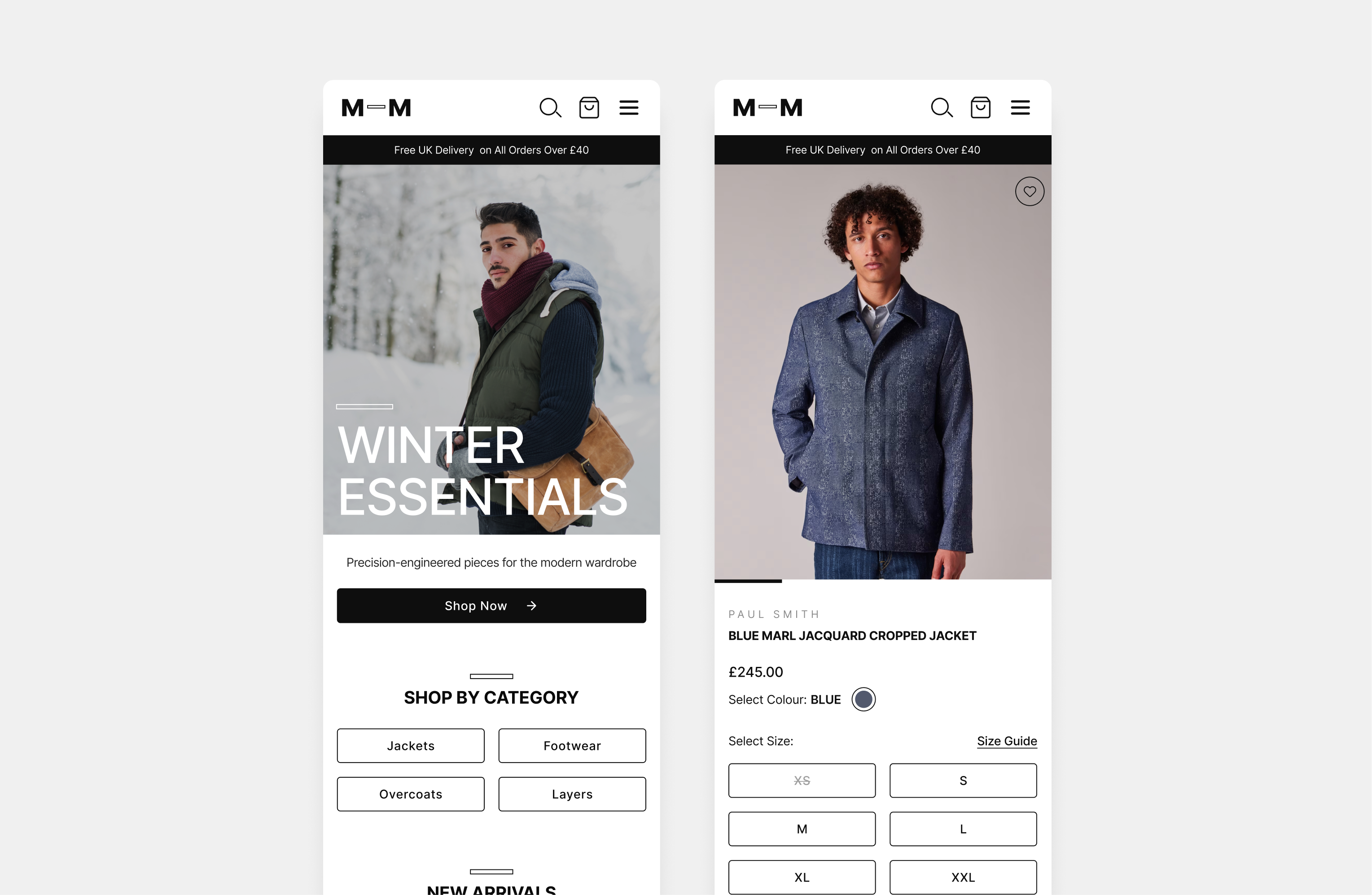
The previous interface accumulated excessive visual noise. The new approach focuses on essential elements, enabling users to navigate the journey with ease while allowing products to remain the focal point. This change directly addresses user feedback about overwhelming choices that caused distraction and frustration. A standout example is the product landing page, which now features a streamlined layout.
This layout was implemented to facilitate a quicker decision-making process, reducing cognitive load, and enabling users to easily refine their product browsing based on their preferences. This modification not only exemplifies clarity but also enhances user engagement by providing a more intuitive shopping experience that aligns with user expectations for a luxury site.
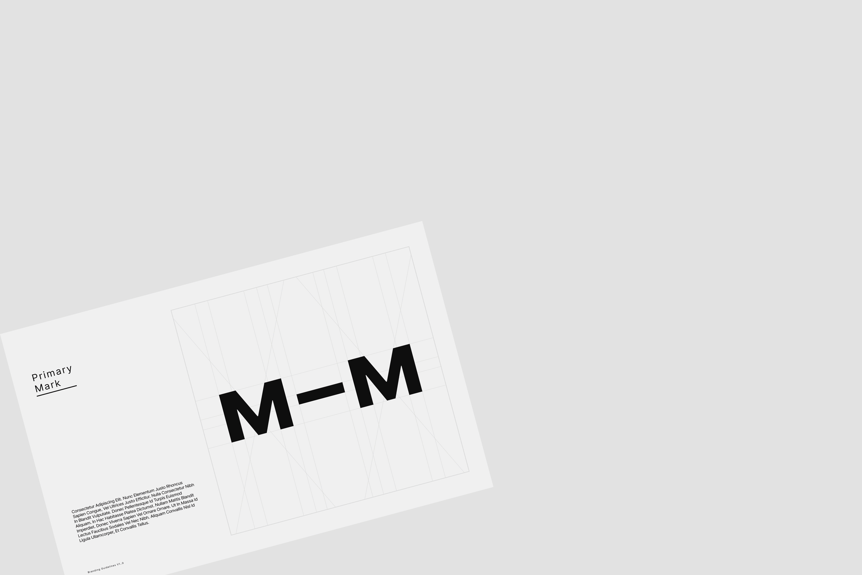
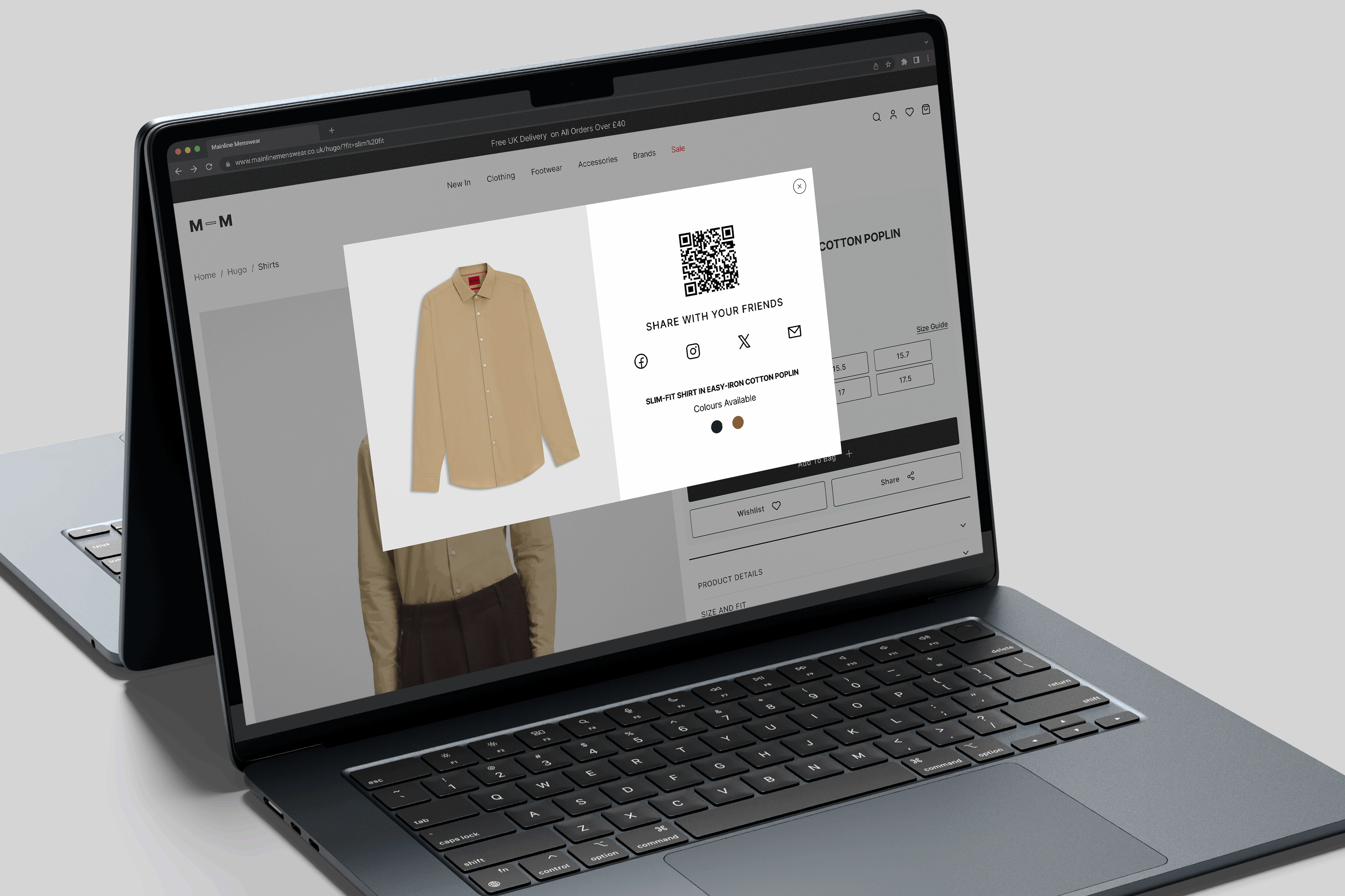
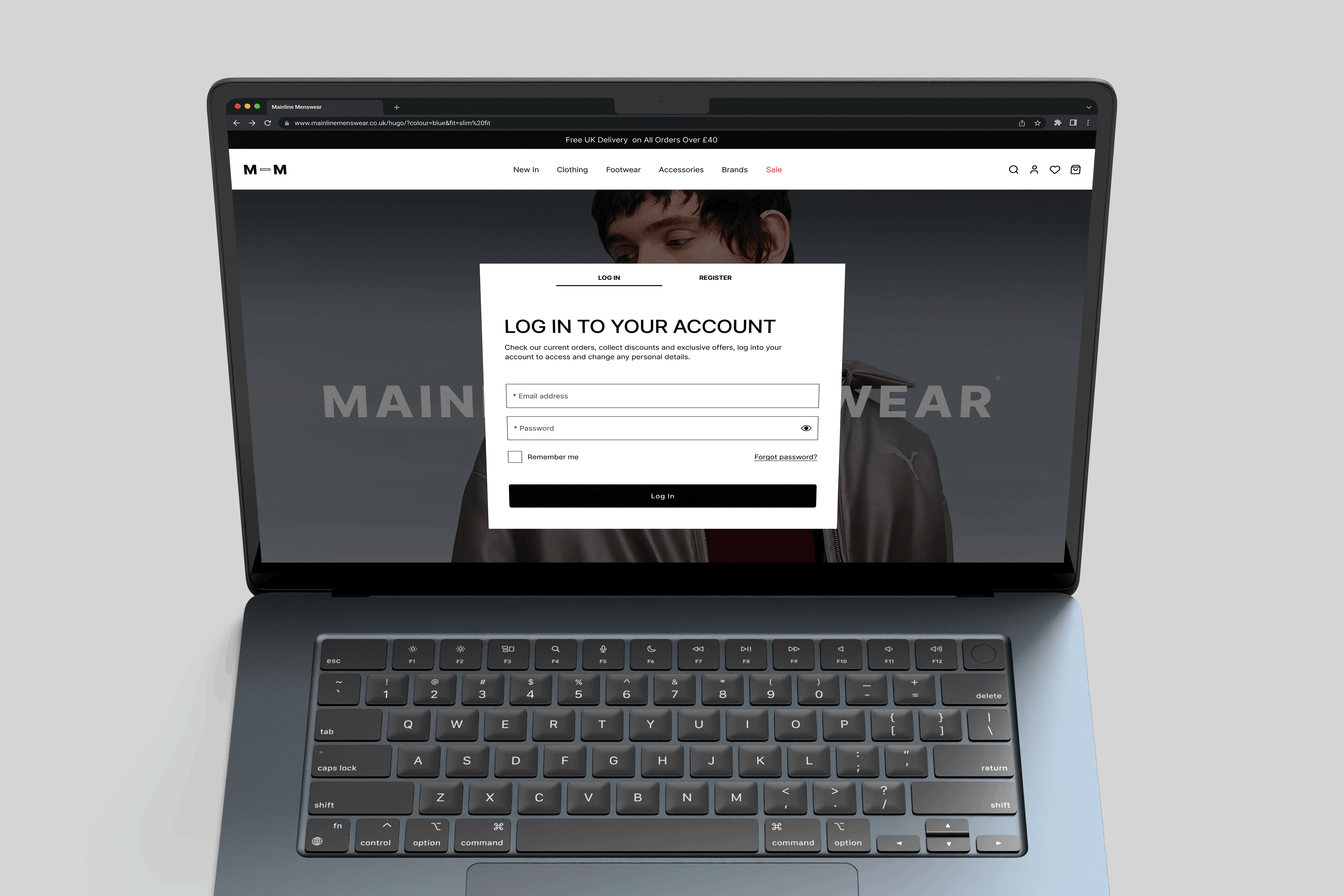
2. A consistent luxury experience
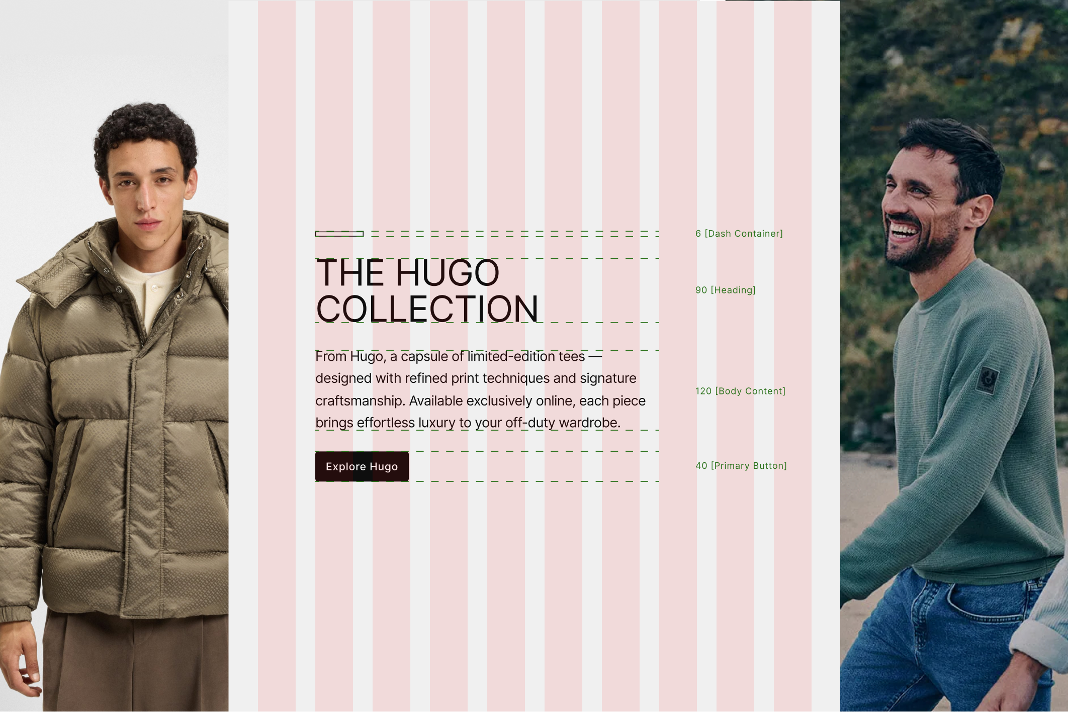
Although Mainline offers premium menswear, the previous design lacked refinement. The updated visual language incorporates balanced typography, ample spacing, high-quality imagery, and an editorial aesthetic. The type scale was meticulously curated to convey elegance and clarity, while ample spacing ensures a refined aesthetic that keeps the design breathable. High-quality imagery underscores the brand’s commitment to offering a premium experience, aligning the visual narrative with the sophistication of Mainline's offerings.
3. Modern design foundations
Two decades of modifications left the sites’ structure unable to progress any further. The solution required comprehensive reconstruction rather than superficial enhancements.
Modern grids, updated components, and an integrated system now support the user experience, facilitating ease of use and scalability.
The site now appears intentional, premium, and user-friendly, aligning with contemporary user expectations. This transformation marks a major victory in user experience, paving the way for seamless luxury shopping. Since the redesign, there has been an increase in conversion rates and overall sales, clearly demonstrating the positive impact on business performance and customer satisfaction.
The interface previously accumulated excessive visual noise. The site is now streamlined to highlight essential elements, enabling users to navigate effortlessly and allowing products to remain central.
The updated visual language, which is more editorial, structured, and confident, now accurately reflects the quality of the products offered. Customers now experience a luxury shopping environment that aligns with the brand's premium positioning.
Modern grids and cohesive systems now make the site easy to navigate, maintain, and scale.

Reduction in build time
From a unified design system and clearer UI patterns
Fewer cross team misunderstandings
Thanks to clearer protoypes and handoffs
Faster concept-to-prototype cycles
Improved workflow → less back-and-forth
Design system uptake
Renewed trust in the system and its consistency
