
When finding your data starts feeling like a game of Where’s Wally, it’s time for a redesign. This project turned a cluttered, inconsistent interface into a clear, structured experience built for real users and a team that desperately needed a fresh foundation.

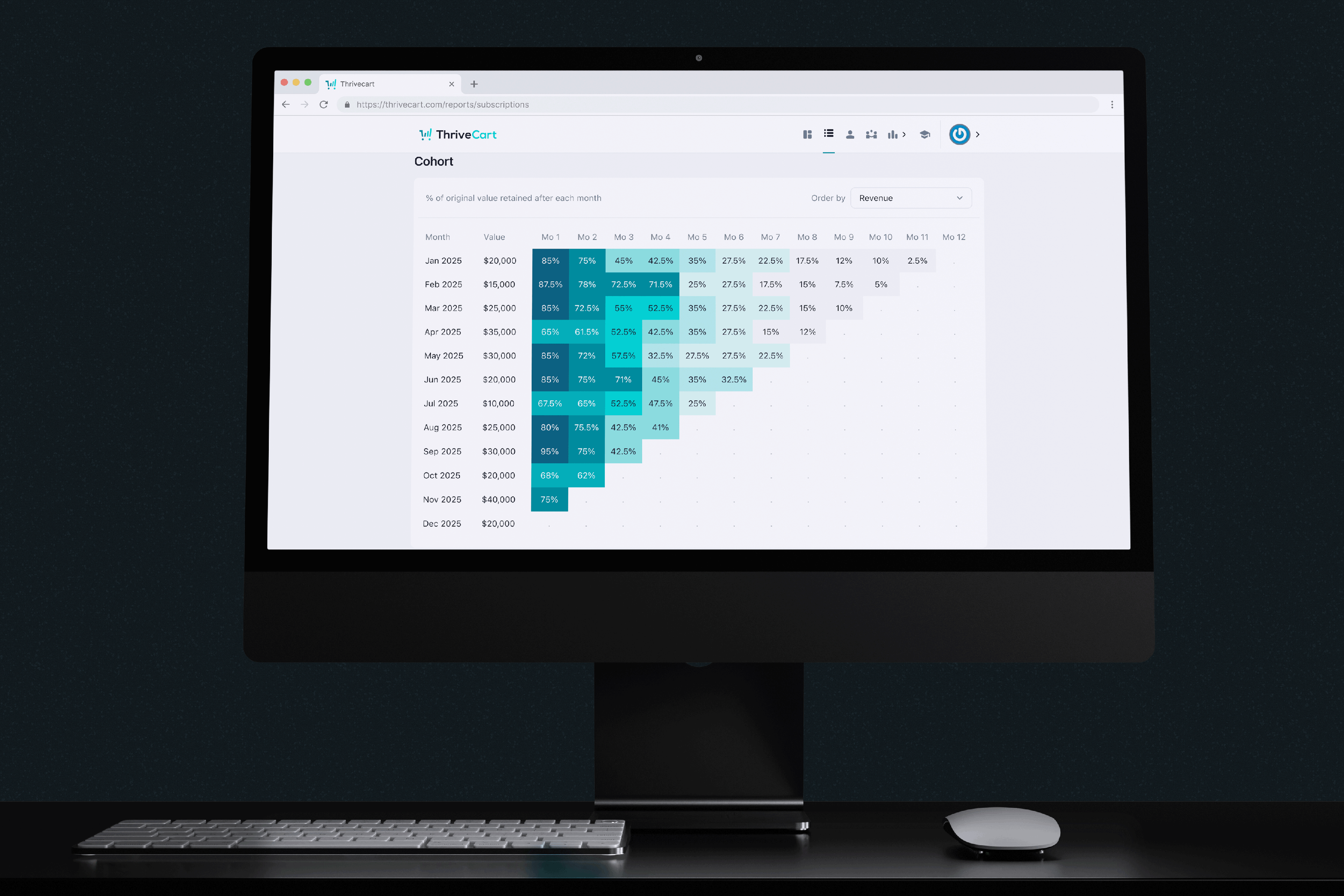
ThriveCart is a platform that empowers creators and entrepreneurs to sell digital products, courses, memberships, and even physical goods; all without touching a line of code.
The platform provides an integrated suite of tools, including checkout flows, landing pages, subscriptions, analytics, and affiliate management, designed for businesses that require rapid and reliable software solutions.
However, the product’s user interface had not evolved accordingly. Years of incremental updates, feature additions, and inconsistent visual styles resulted in an interface that was increasingly difficult to navigate and maintain. Initial observations of minor UX issues revealed more fundamental challenges.
The primary responsibility involved modernising the user experience, reducing cognitive load, and reconstructing the visual and system foundations to support scalable future development.
Year
2025
Role
Product designer
Industry
Saas, Design system, Desktop
Brand
Thrivecart

Customer satisfaction up from intial testing
Conversion for data-screen tasks up
Overall customer ratings up
Customer referral codes used
The interfaces appeared overly dense, navigation lacked intuitiveness, and essential information was obscured by visual clutter. Routine tasks required more cognitive effort than necessary.
Accessibility issues across colour selection, text-background contrast, spacing between elements, and font legibility created friction at first glance.
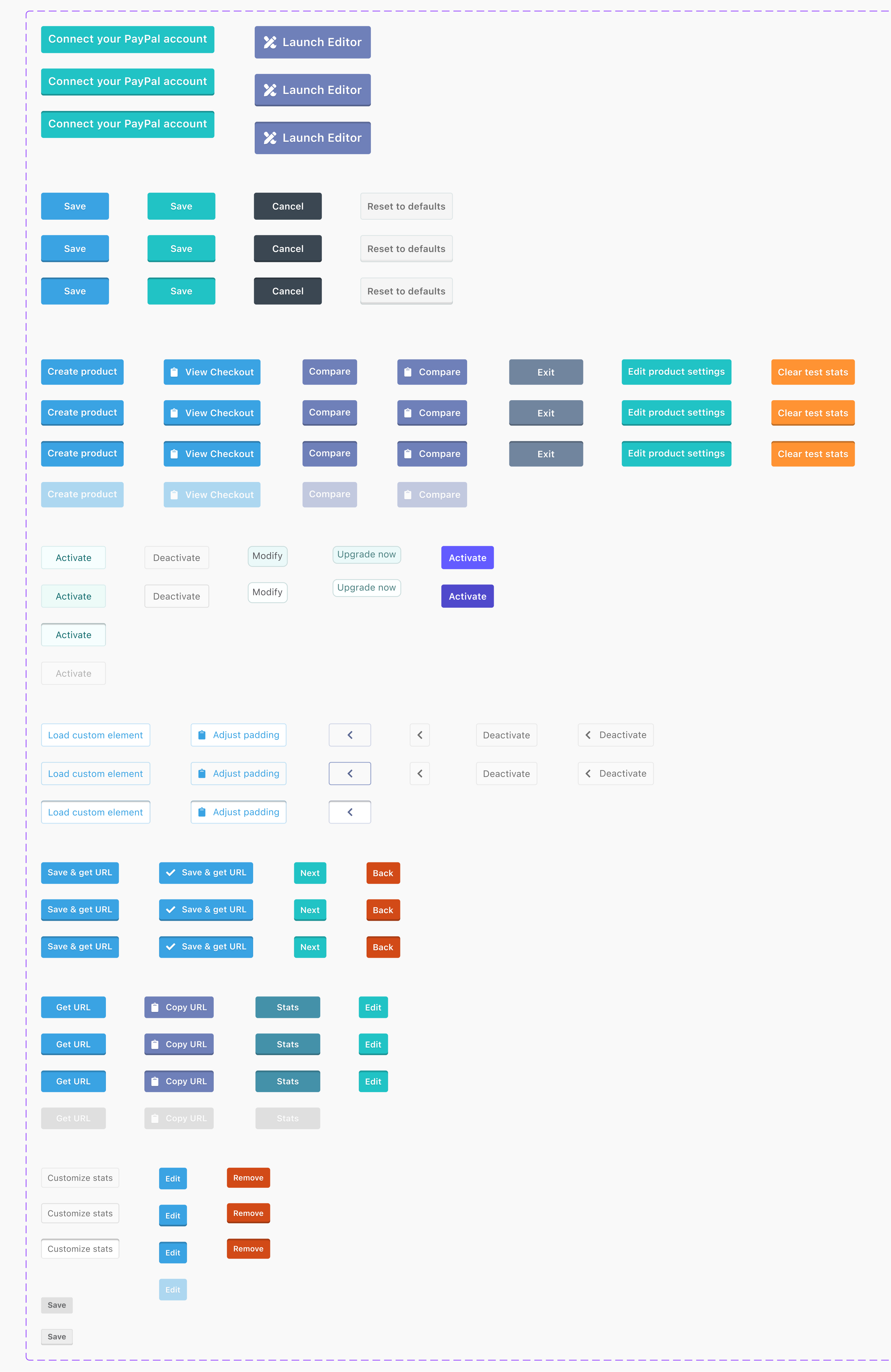
Inconsistent patterns (repeated ways things are shown or work throughout the app) and mismatched components (interface elements that look or function differently) made the interface feel unpredictable and harder to learn.
Cognitive load increased significantly, in usability testing, it was observed that tasks took longer than average to complete due to the complex interface. When compared to industry benchmarks, where similar tasks average around 5 minutes, the disparity became even more apparent. The more users relied on the dashboard, the more mentally tiring it became.
Behind all of this sat a bigger truth: A fragmented design system that was slowing users and, most of all, the team.
A platform built to empower fast-moving entrepreneurs shouldn’t make them work hard to understand their own data. Clarity, consistency, and accessible design weren’t just nice-to-haves; they were mission-critical.
Many elements and components of the UI were failing even the most basic accessibility guidelines.
- User feedback
- User feedback
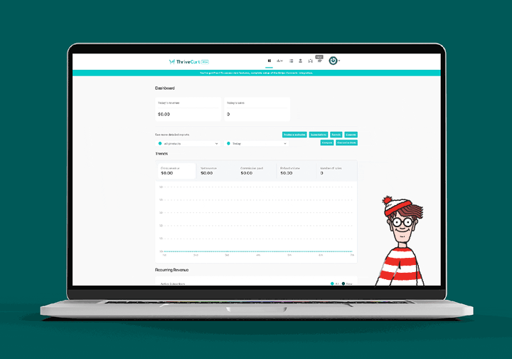
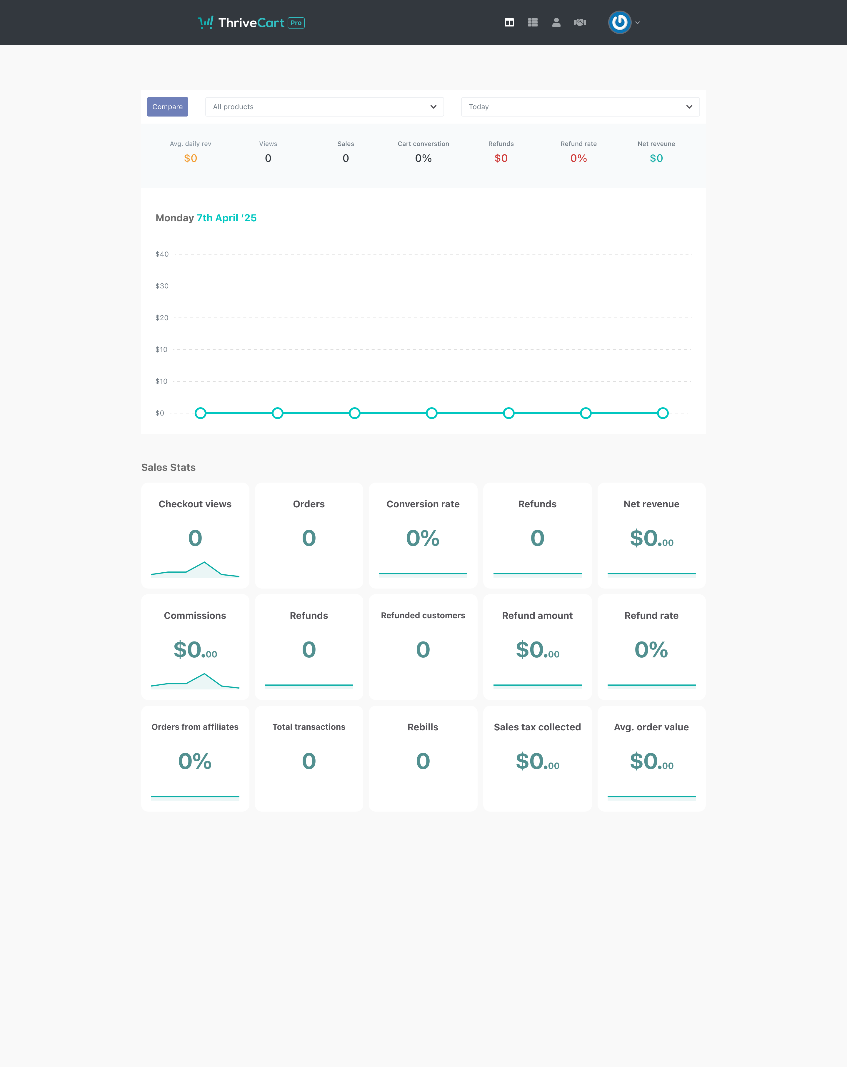
The old UI dashboard screen.
- User feedback
The old UI dashboard screen.
Initially, it appeared that minor UI adjustments, such as revising the type scale or tweaking contrast, might address the issues. However, further examination revealed that these changes merely rearranged the existing clutter.
Quick fixes exposed more significant issues, including inconsistent components, mismatched spacing, legacy colours, and patterns that varied across the platform. The product exhibited numerous design inconsistencies rather than isolated minor flaws. The product wasn’t suffering from “a few rough edges”, the interface required a comprehensive overhaul.
A thorough analysis of the interface revealed the underlying issues:
Accessibility gaps were obvious, including low contrast, unpredictable hierarchy, and visual elements that competed for user attention.
Inconsistent patterns & components, making the experience feel different from screen to screen.
Cognitive load spikes, especially in data-heavy areas where scanning should be effortless, not exhausting.
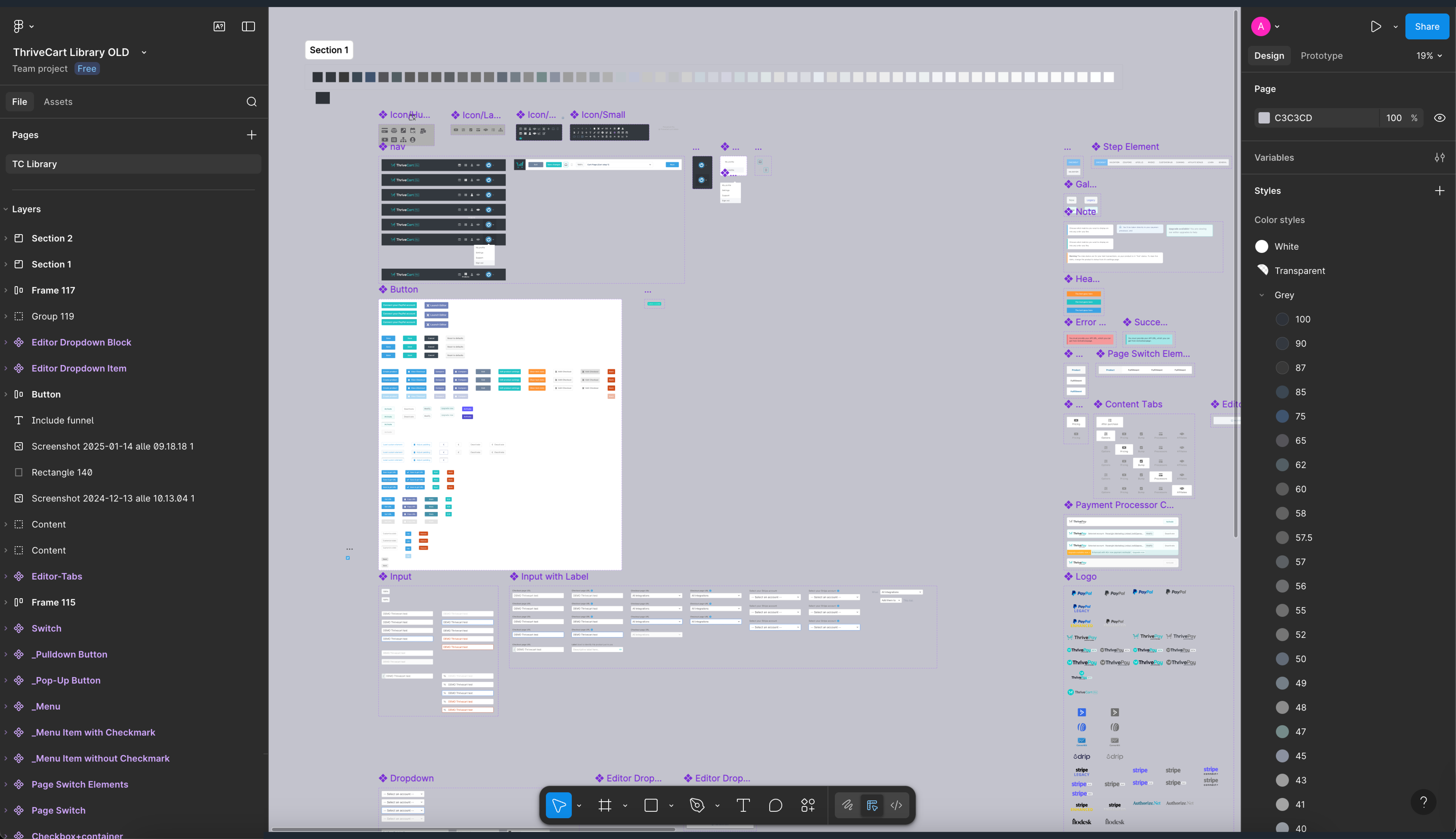
No single source of truth, meaning designers, developers, and users were all speaking slightly different visual languages.
The audit made it clear: rebuilding a unified, scalable design system was necessary.

The before and after the quick fixes to the old interfaces design.
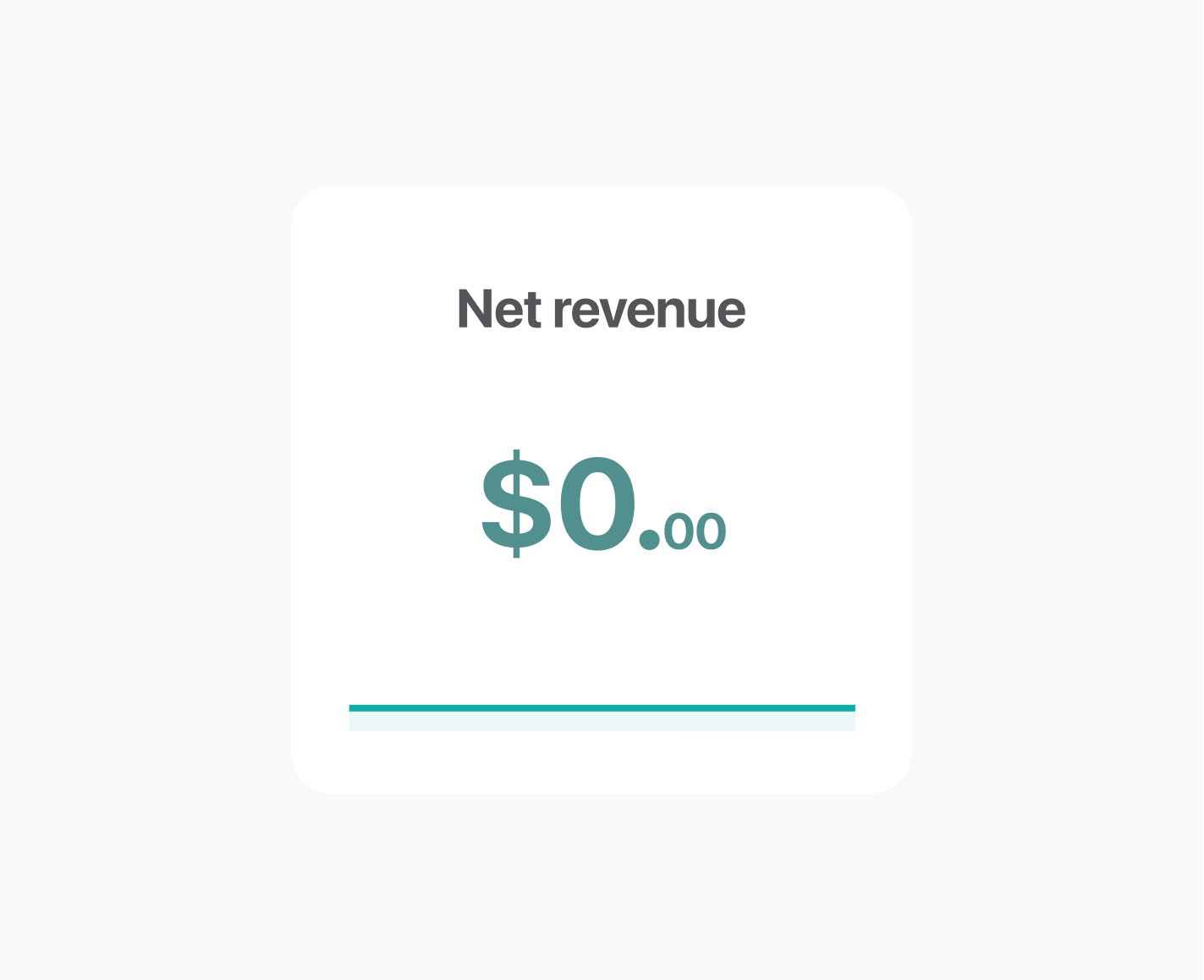
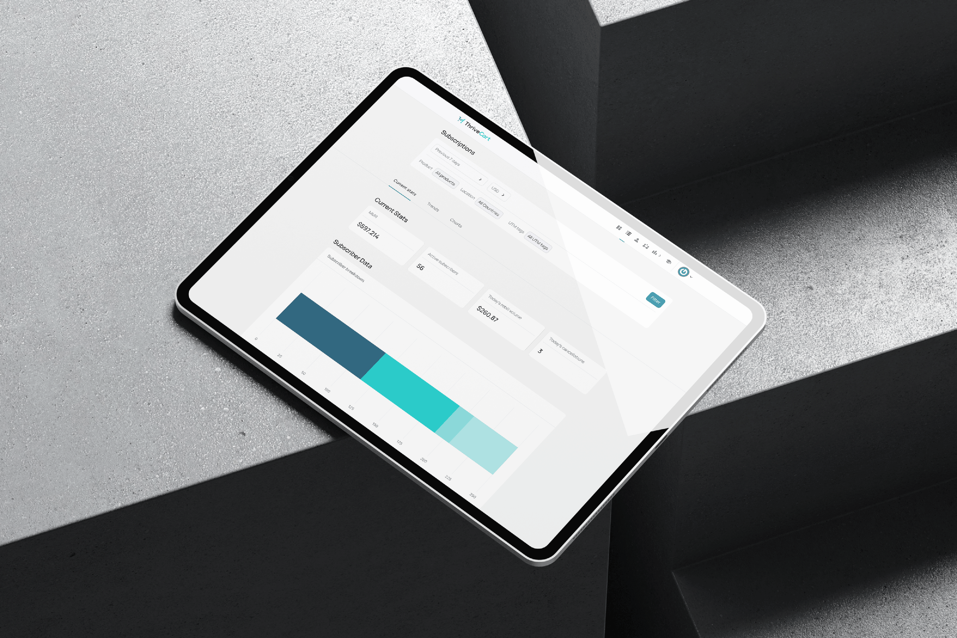
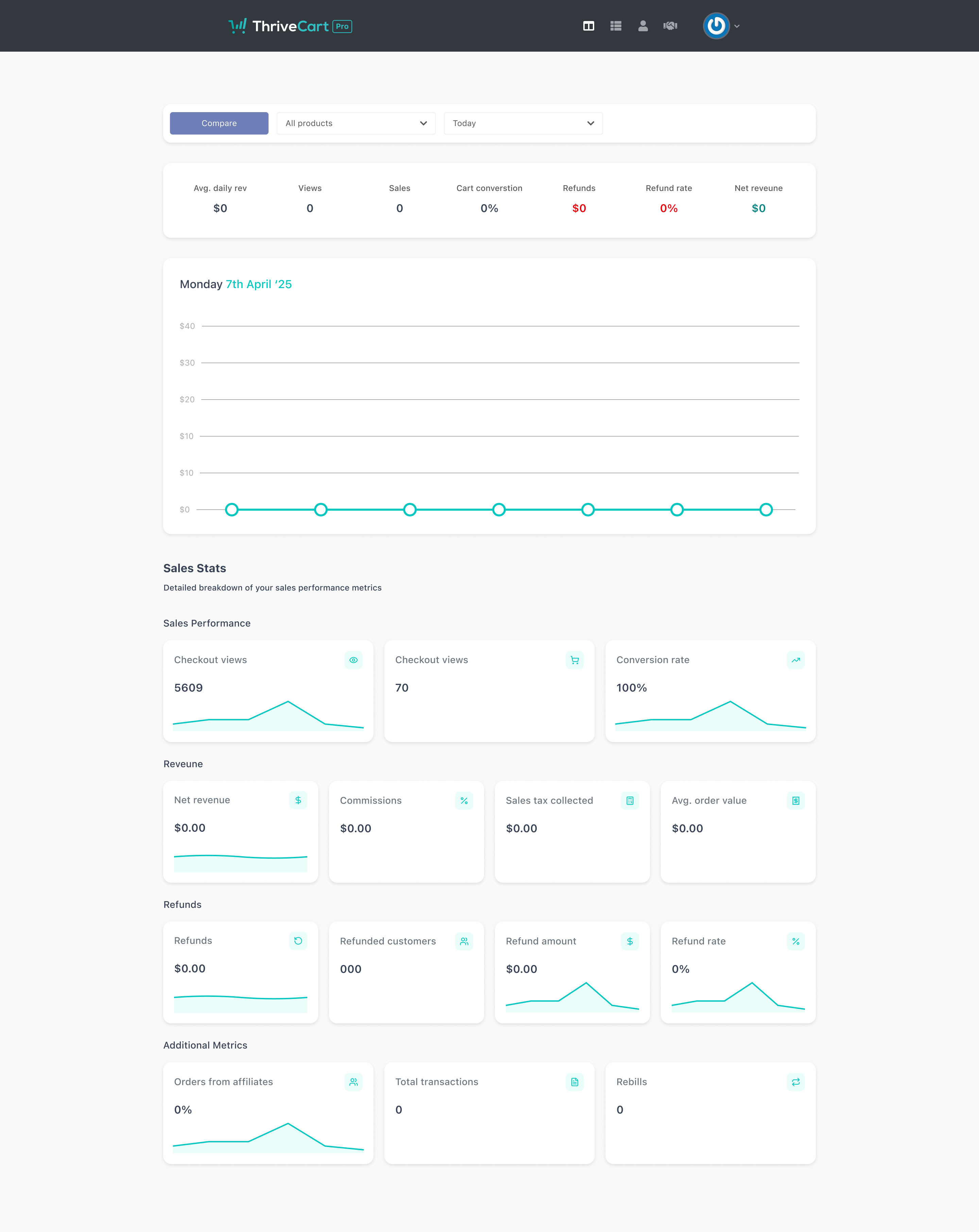
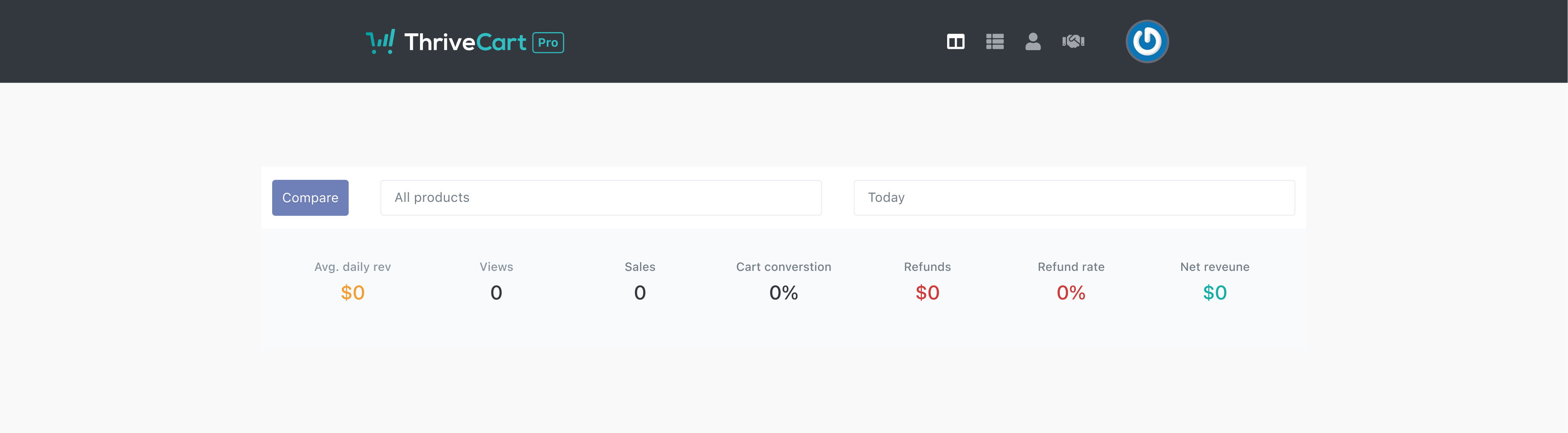
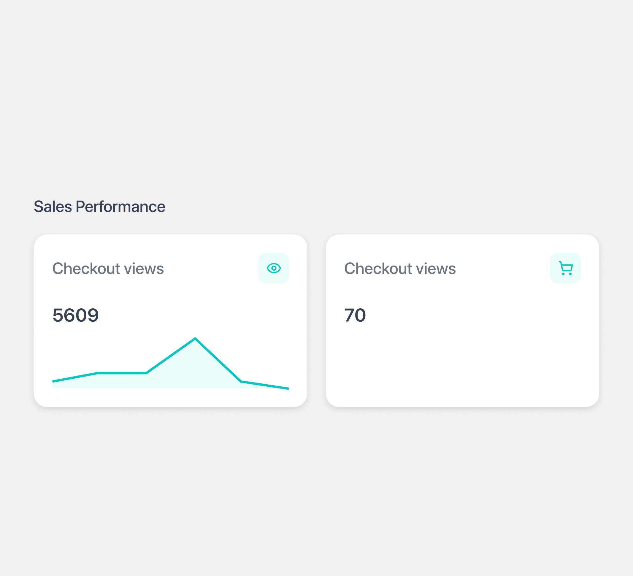
The old UI styling for cards that showcase the users data
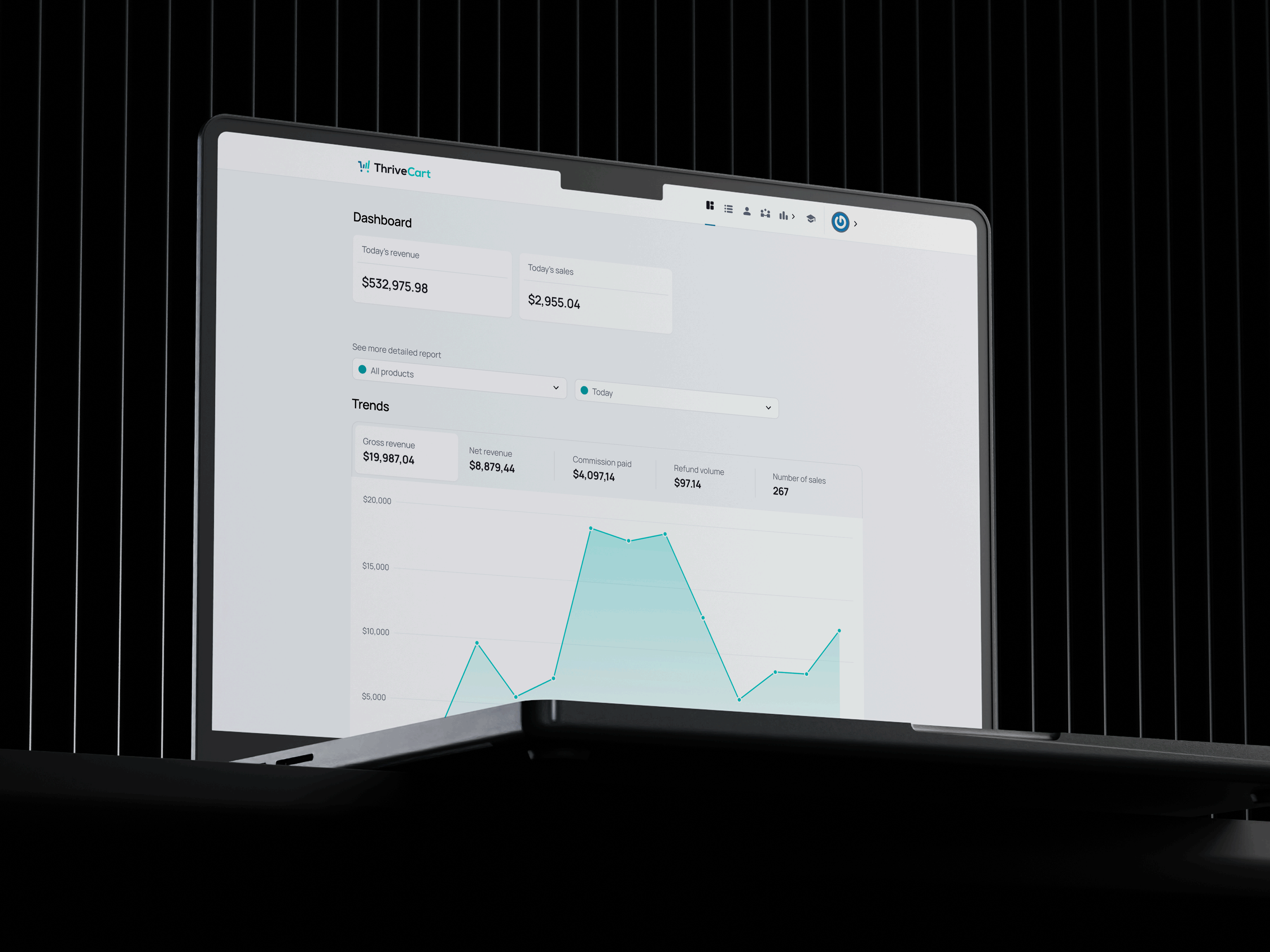
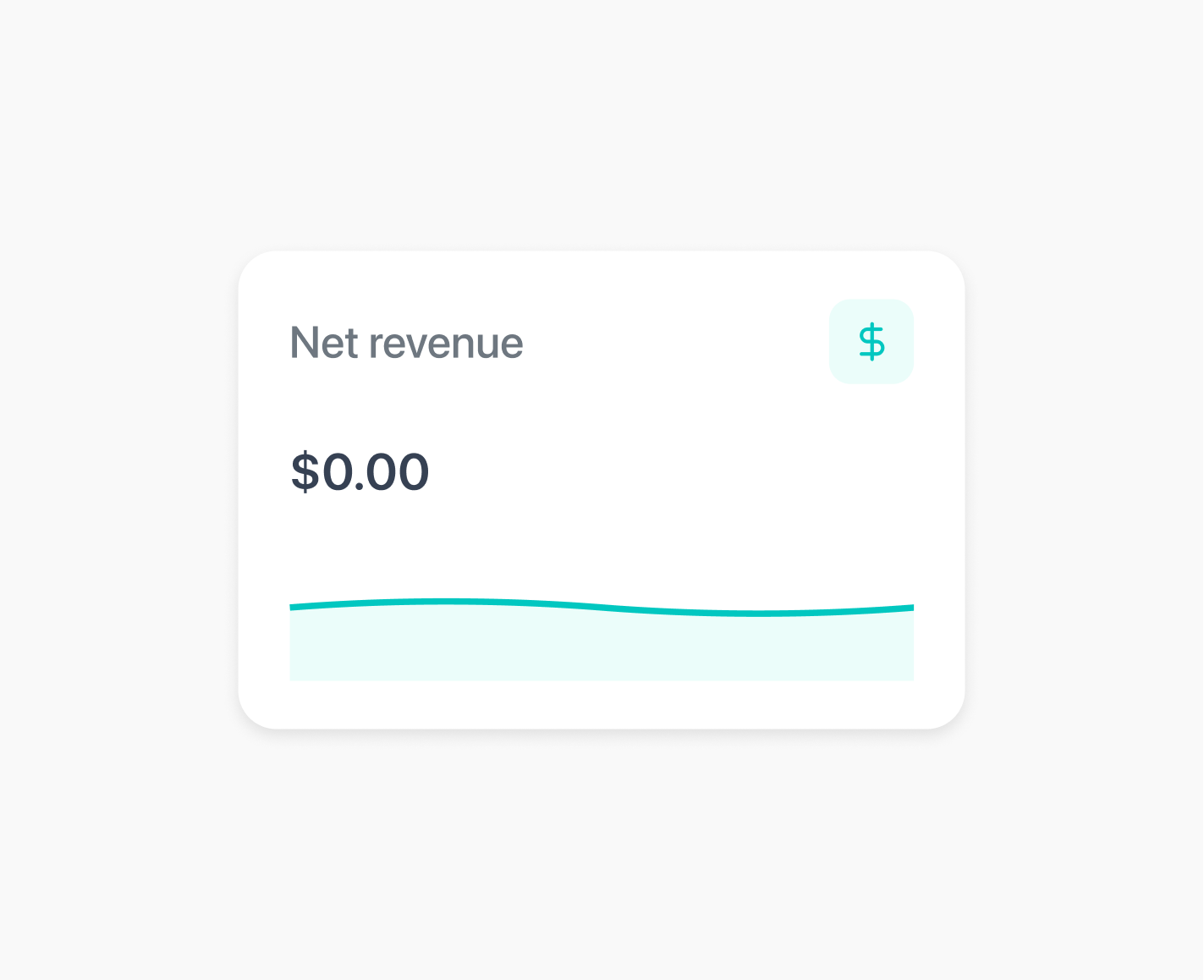
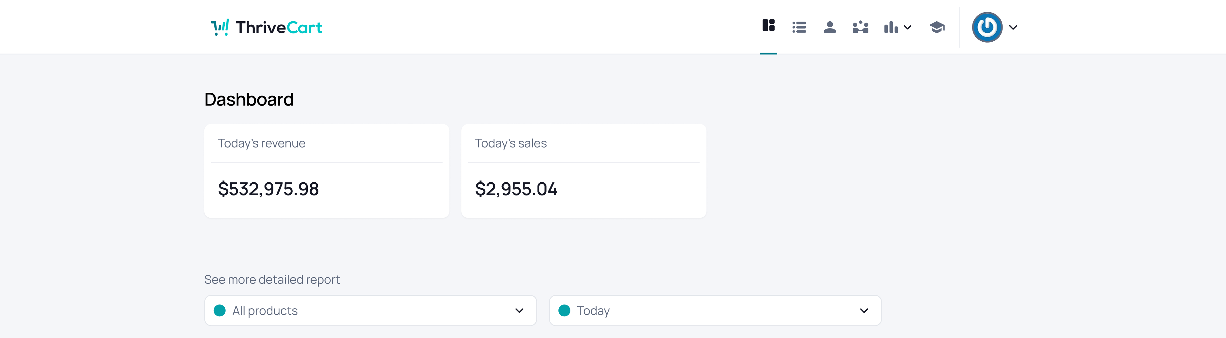
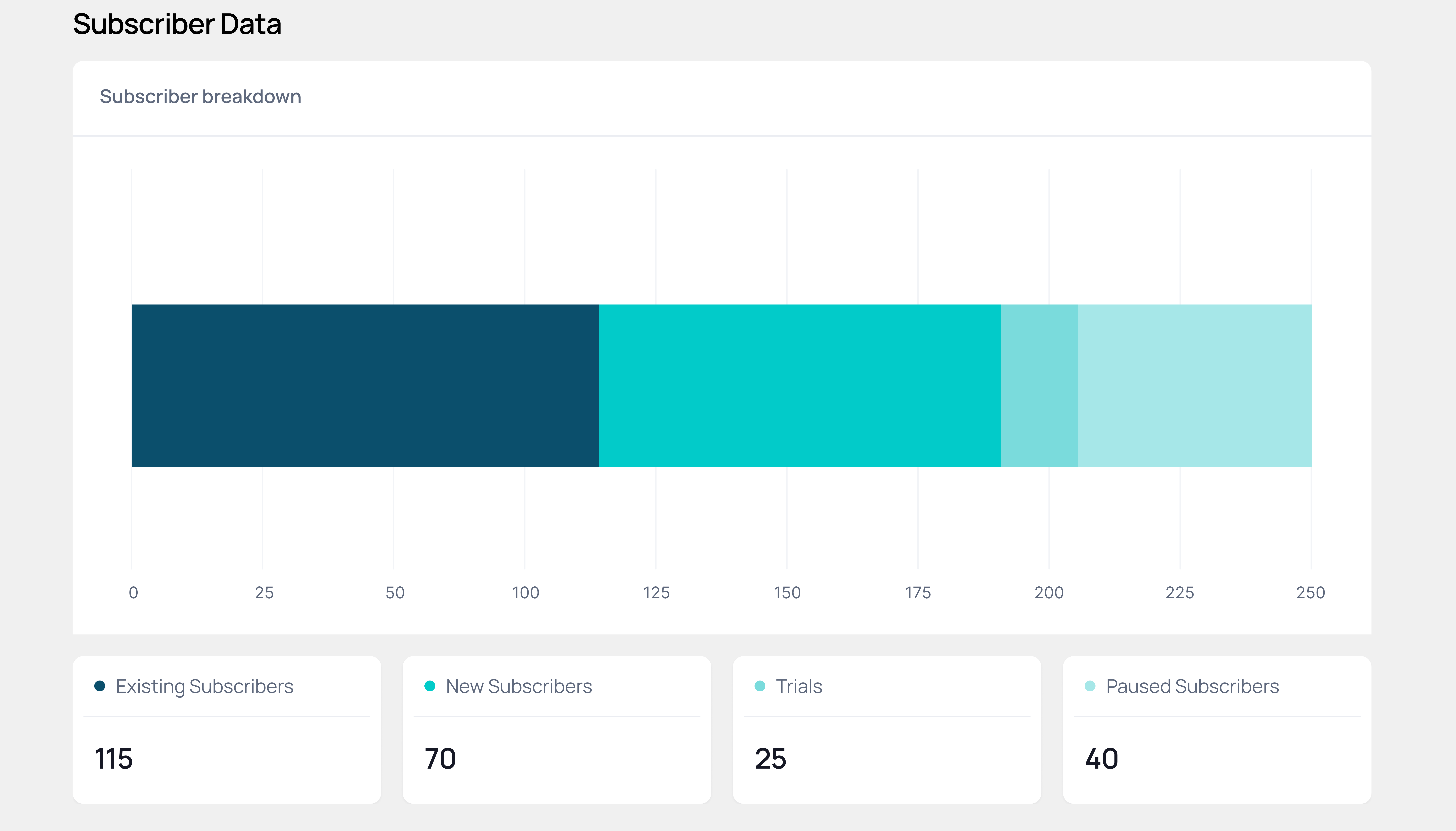
An altered version to help users visualise the data more accessible.
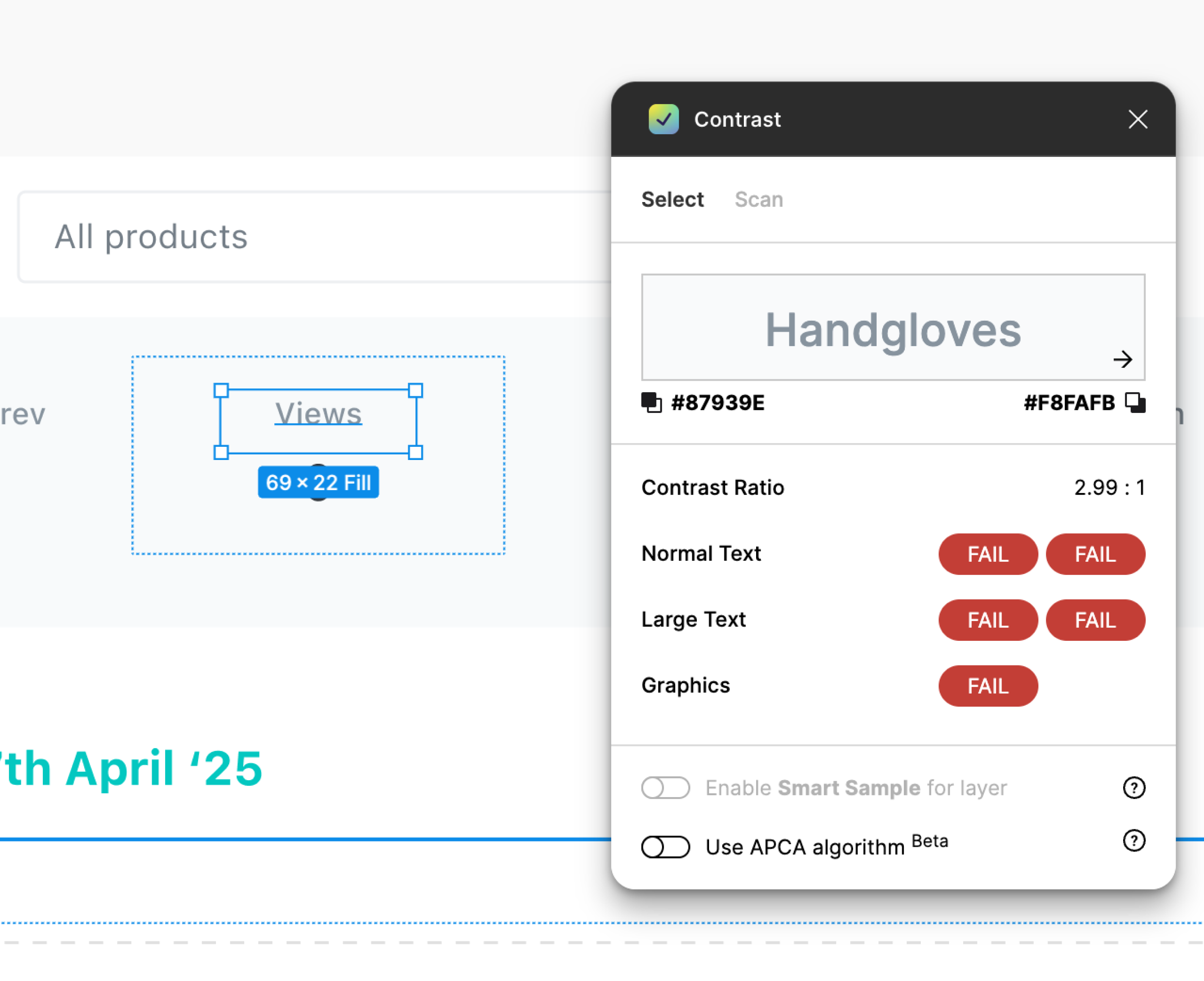
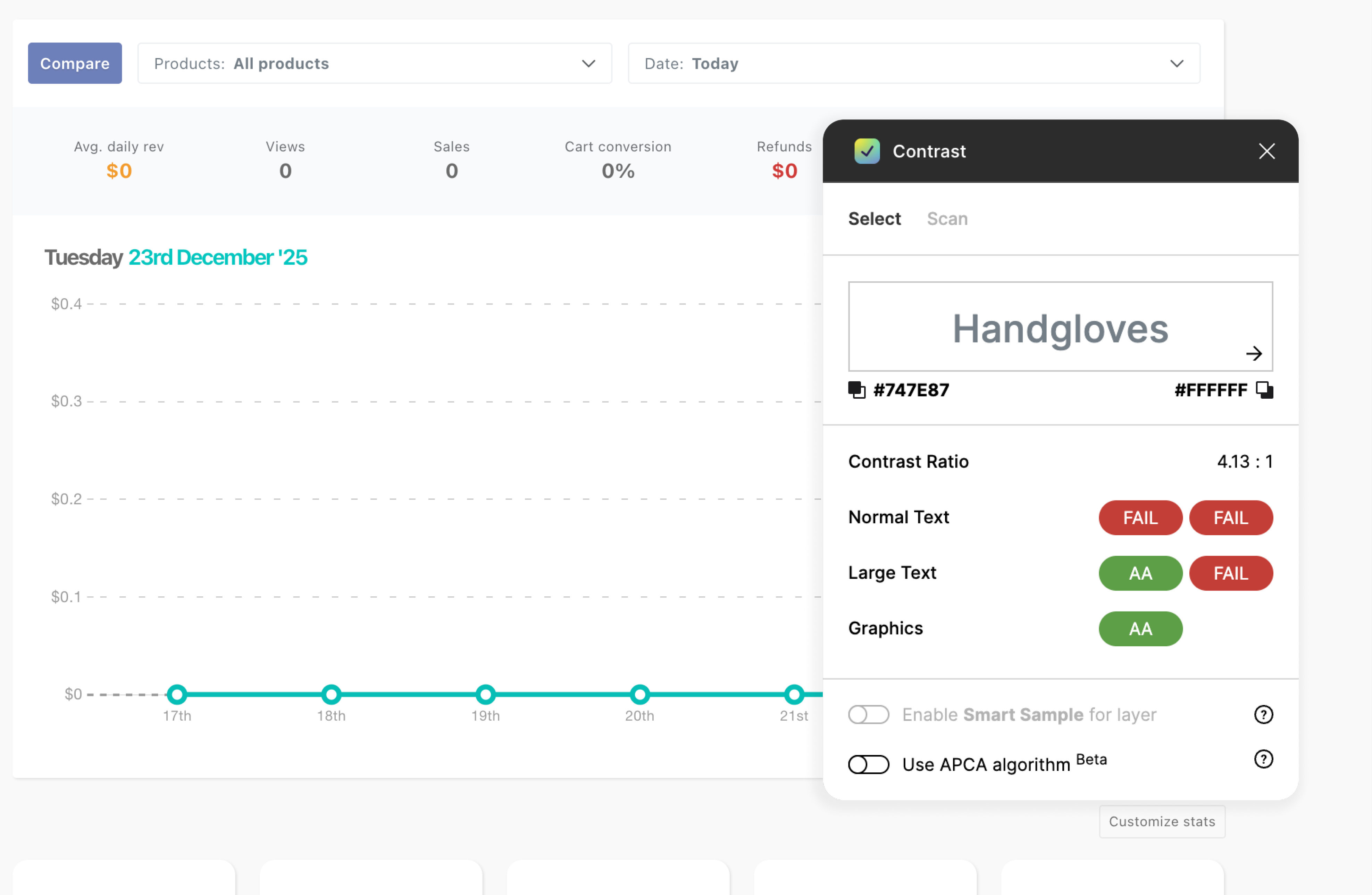
The current UI hadn’t met the essential AA accessibility standards.
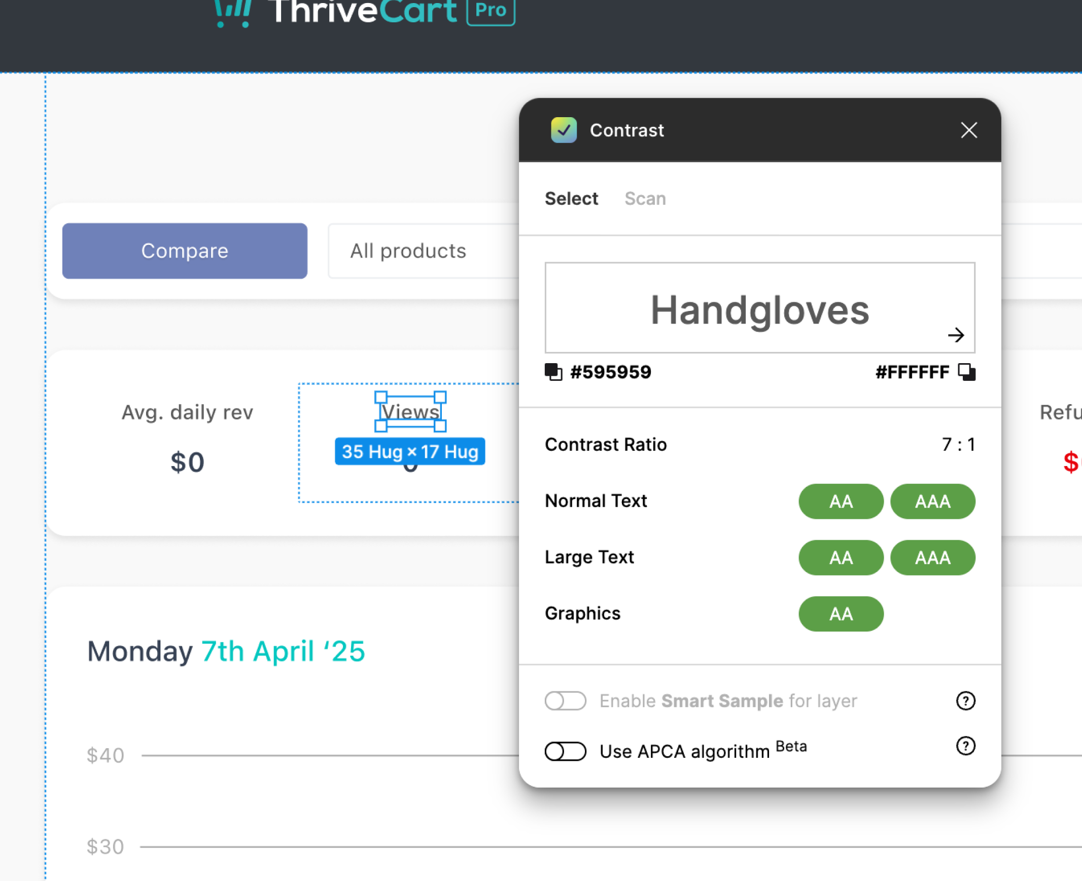
With the accessibility improvements in place, the updated design now met at least the AA standard.
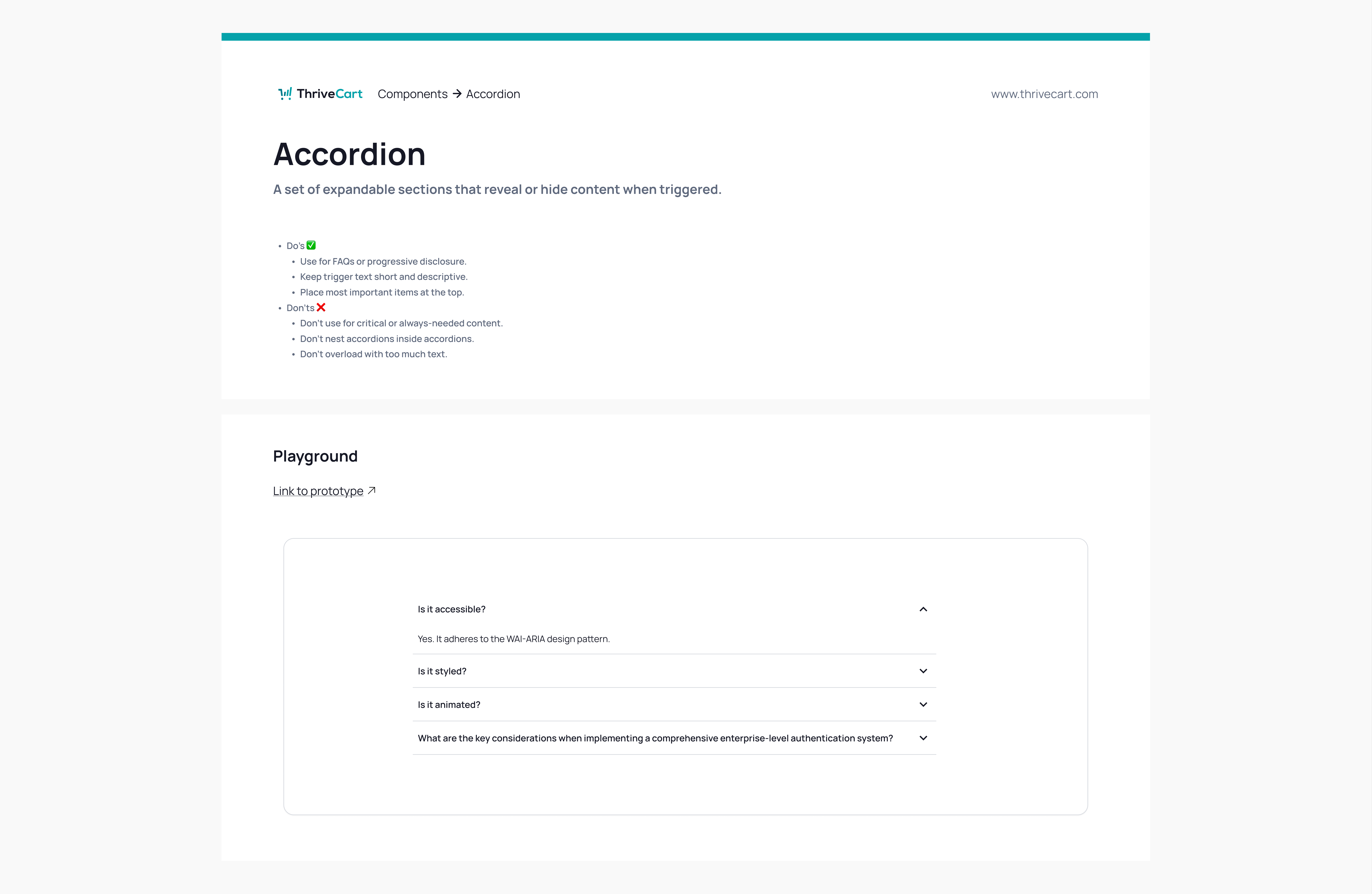
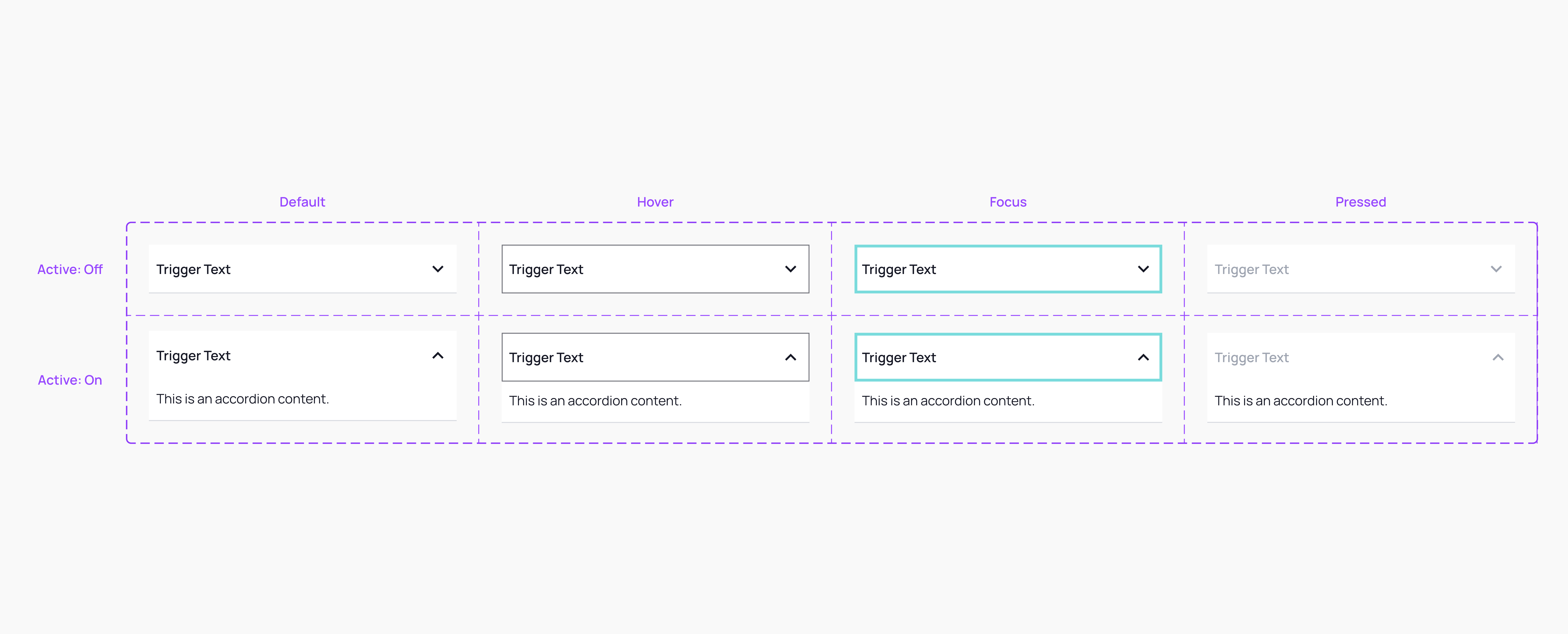
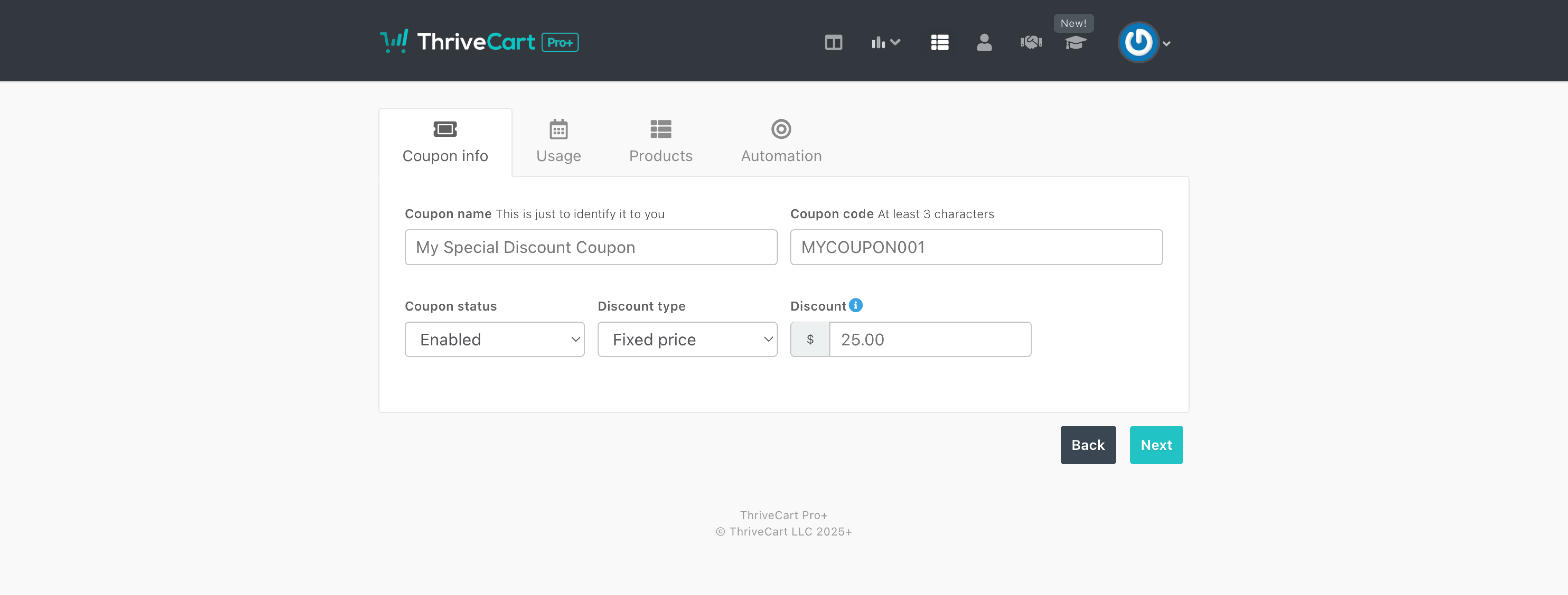
The current design system was used to create new or updated components for ticket requests.
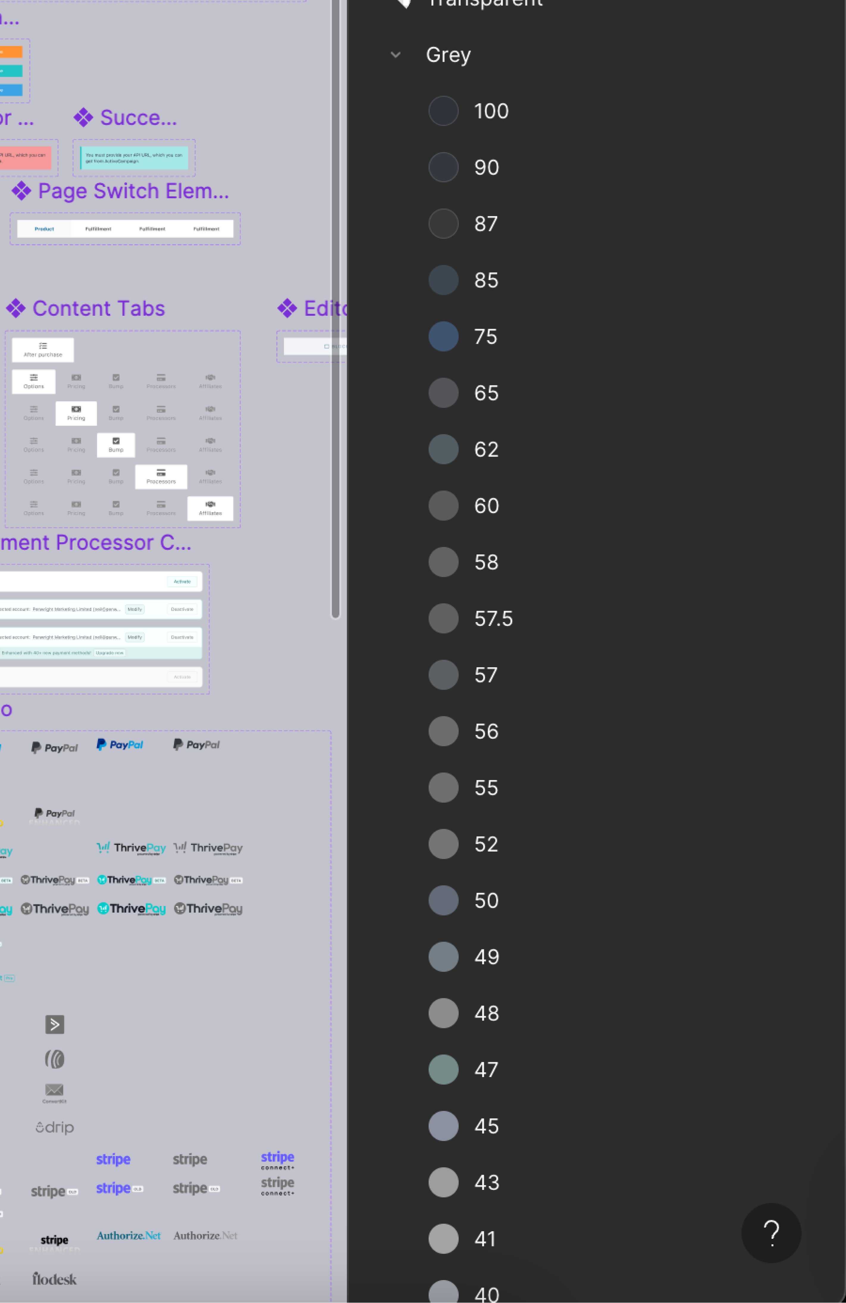
An example of the chaotic colour styling that designers and developers struggled to keep the UI consistent.
There were groups of components left in the design system with no labels, no guidance documentation, and no support for stakeholders or designers.
The audit confirmed ThriveCart needed a new foundation, not just new screens. Years of UI drift had produced inconsistent spacing, unpredictable hierarchy, stray colour choices, and components that behaved more like distant relatives than family members.
Built Around Three Core Objectives
Reduce cognitive Accessibility
By simplifying visual patterns and creating a predictable hierarchy, data-heavy screens became calmer and easier to interpret.
Improve design & development efficiency.
A system of tokens, rules, and documented patterns replaced guesswork with clarity — accelerating everyday work for designers and developers alike.
Modernise the visual language.
Updated typography, spacing rhythm, and a unified colour architecture gave the entire product a more contemporary, premium feel.
A unified colour token system with accessibility baked in
A consistent spacing scale for structure and breathing room
Clear typography hierarchy with defined semantic roles
A flexible layout grid suitable for data-heavy interfaces
Predictable interaction patterns
Documentation to stop future “creative improvisations”
The team finally had a shared foundation, a system that didn’t just look better, but worked better.
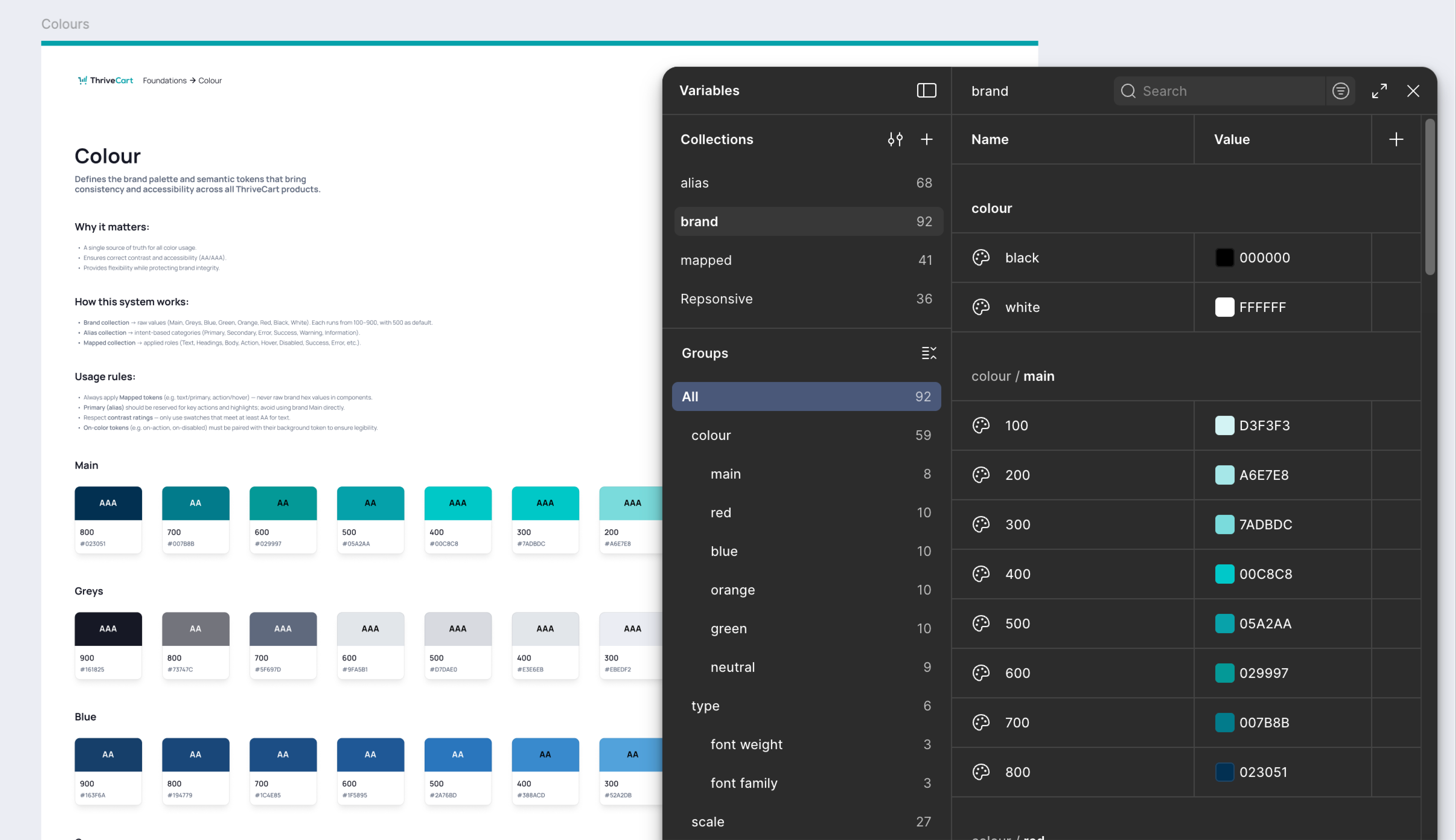
From a colourful guessing game to a structured, accessible palette.
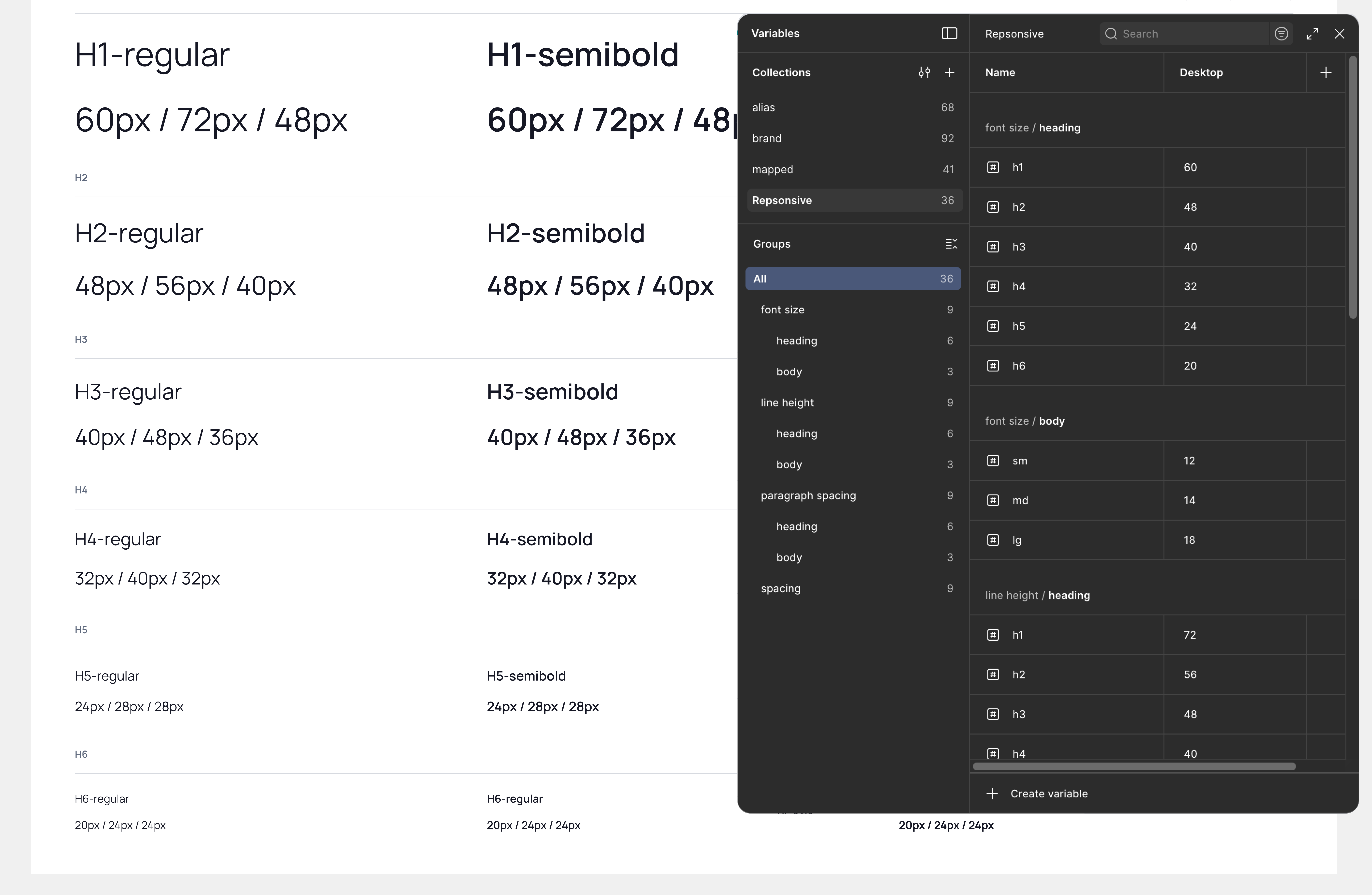
A type system that finally agrees with itself.
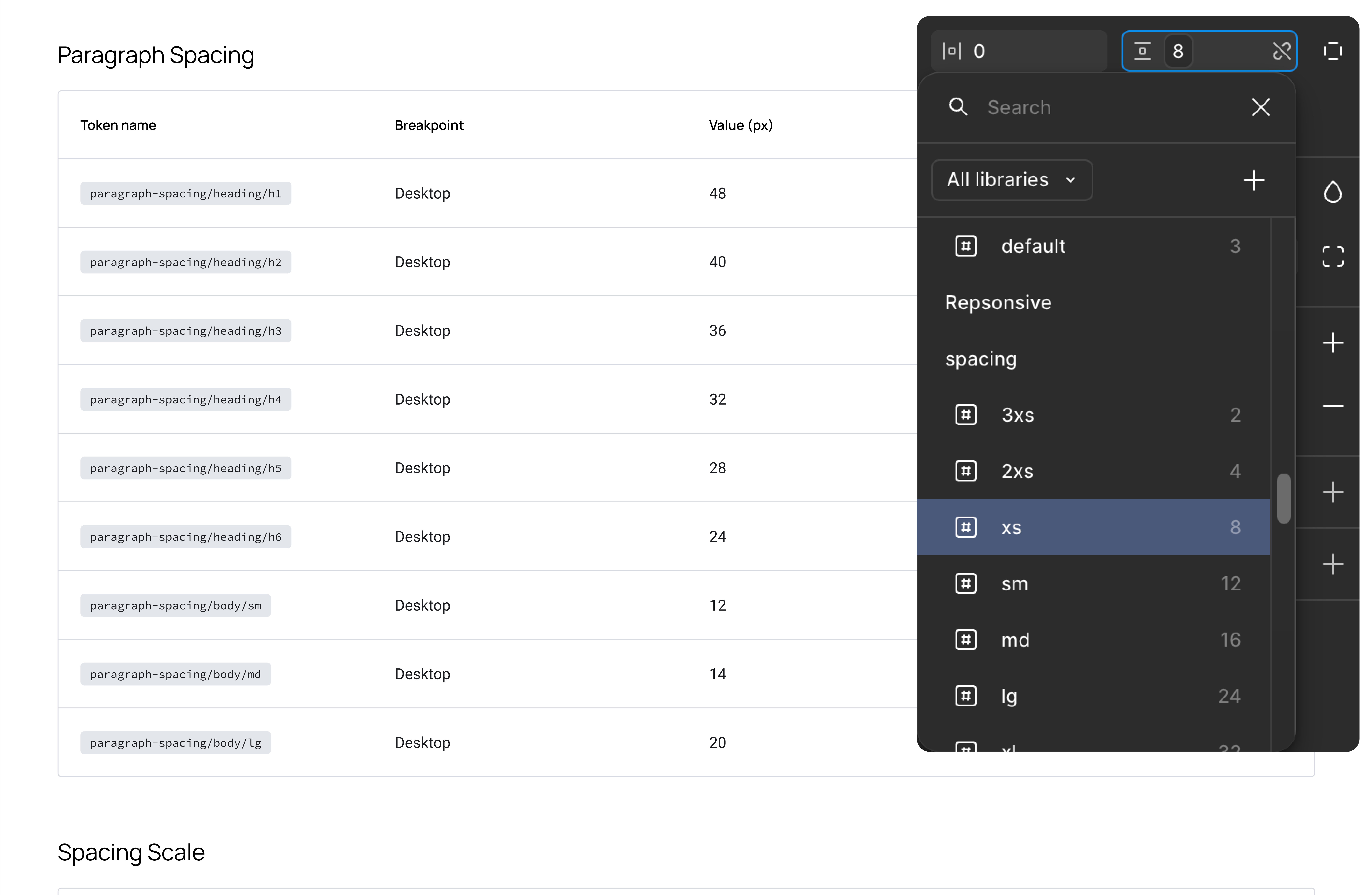
The skeleton that keeps everything upright.
A shared language for design, product, and engineering.
Predictable behaviour, finally consistent across the product.
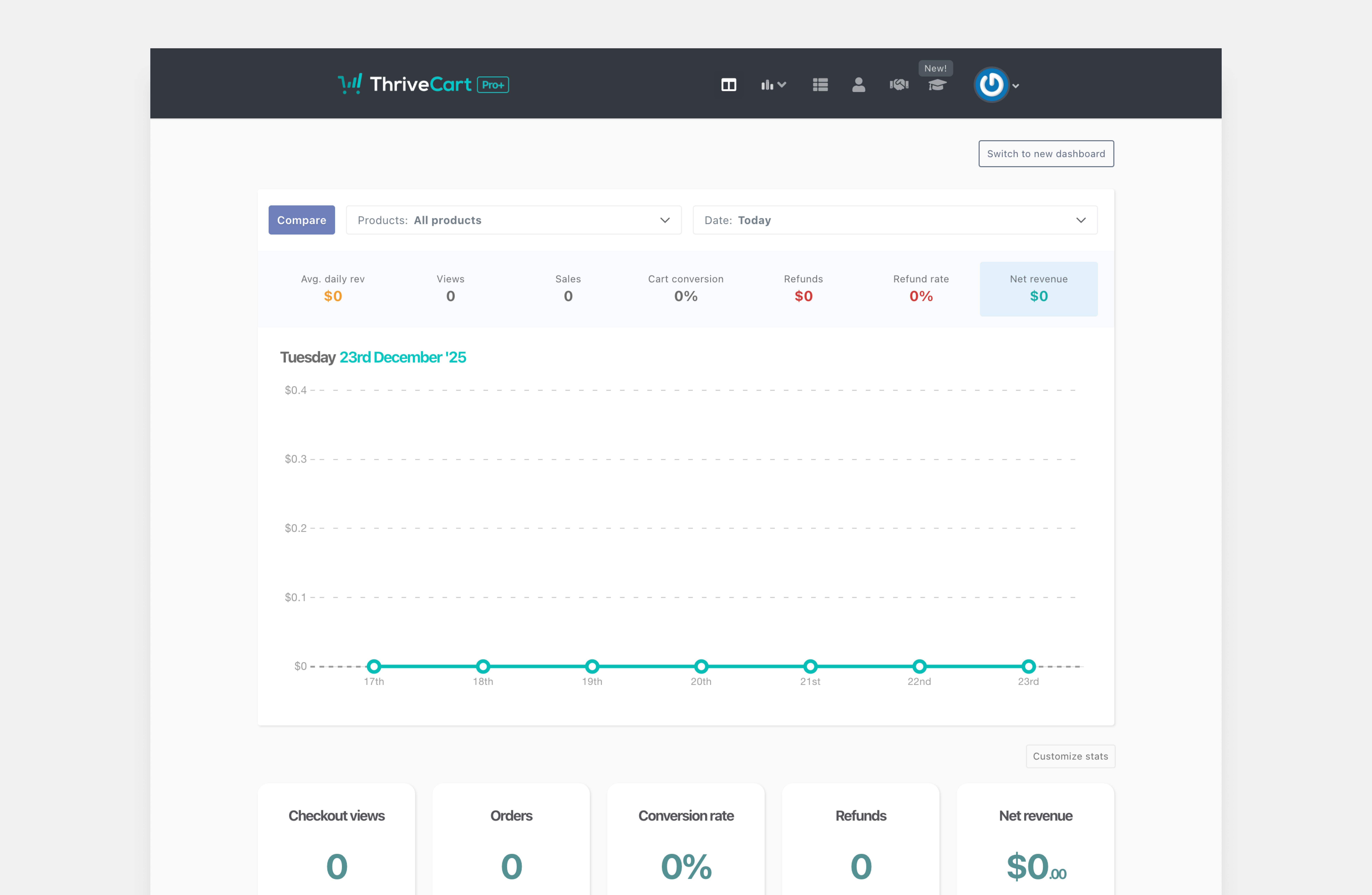
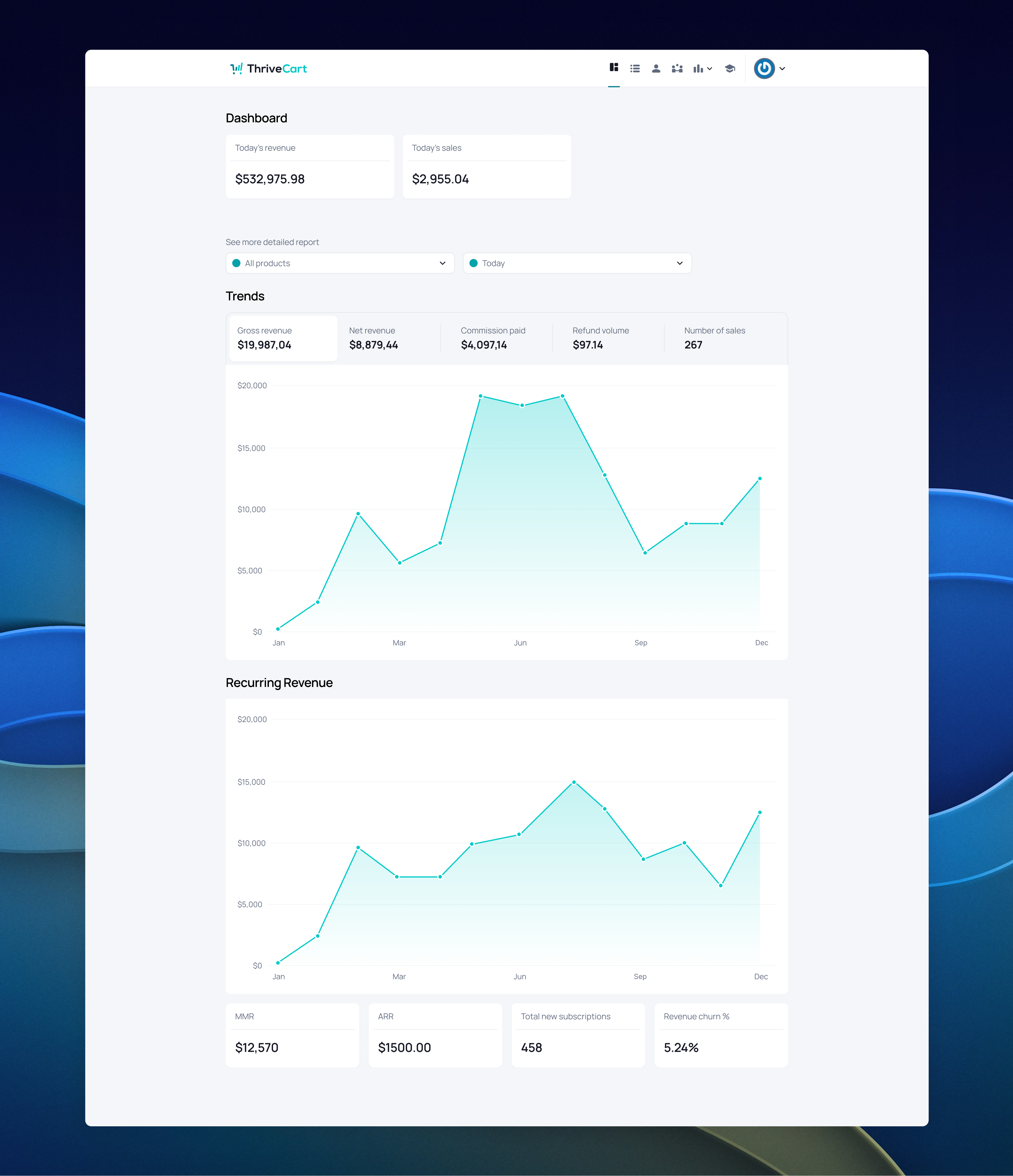
With the implementation of the new design system, the product began to present a unified and cohesive experience. All core screens benefited from these improvements. A coherent user experience translates into higher customer satisfaction, increasing customer retention rates and reducing support tickets. These improvements ultimately boosted customer lifetime value. By delivering a seamless UI, we strengthen our competitive edge and secure our position as a superior choice for businesses in need of efficient digital solutions.
The application of new spacing, grid, and hierarchy rules made previously dense screens easier to scan. Data presentation became more orderly, enabling users to locate information efficiently.
The application of new spacing, grid, and hierarchy rules made previously dense screens easier to scan. Data presentation became more orderly, enabling users to locate information efficiently.
The application of new spacing, grid, and hierarchy rules made previously dense screens easier to scan. Data presentation became more orderly, enabling users to locate information efficiently.
The previous UI, with its fragmented changes, transformed into a cohesive experience through the use of a solid, unified design system — shifting from noise to narrative.
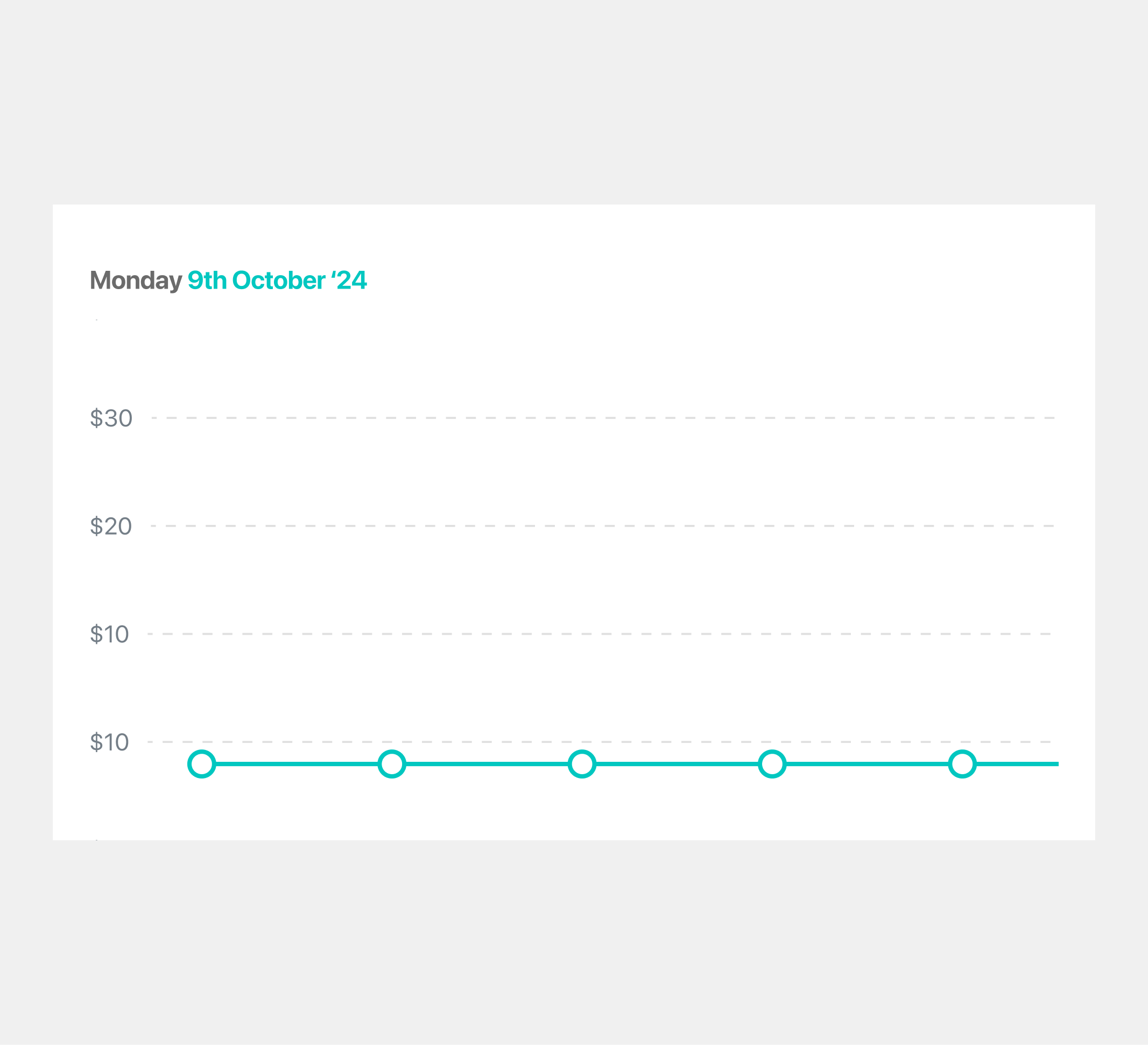

An older graph style used for presenting data to users.
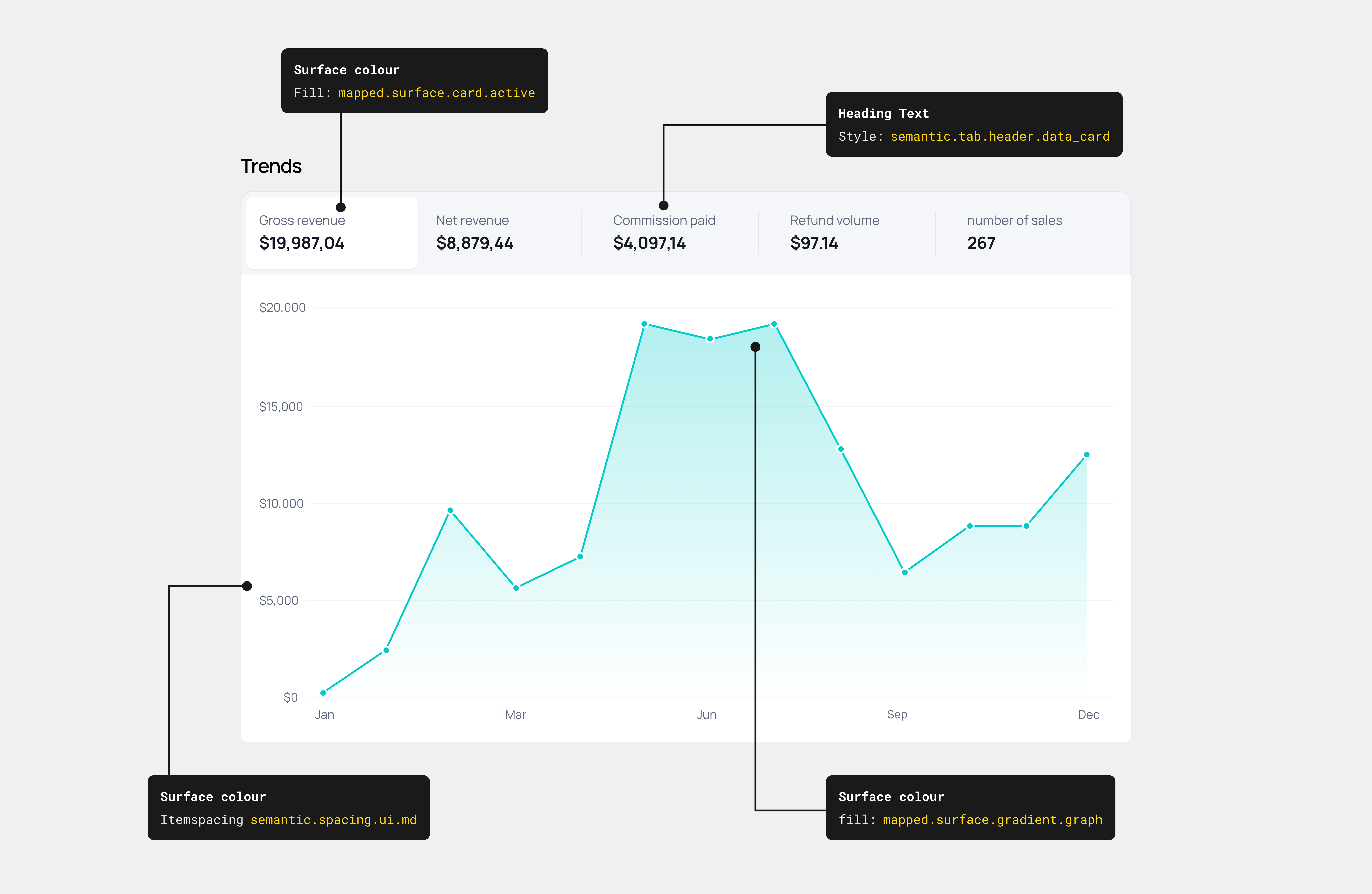
An altered version of the UI data cards, as the previous designs no longer aligned with the updated interface.

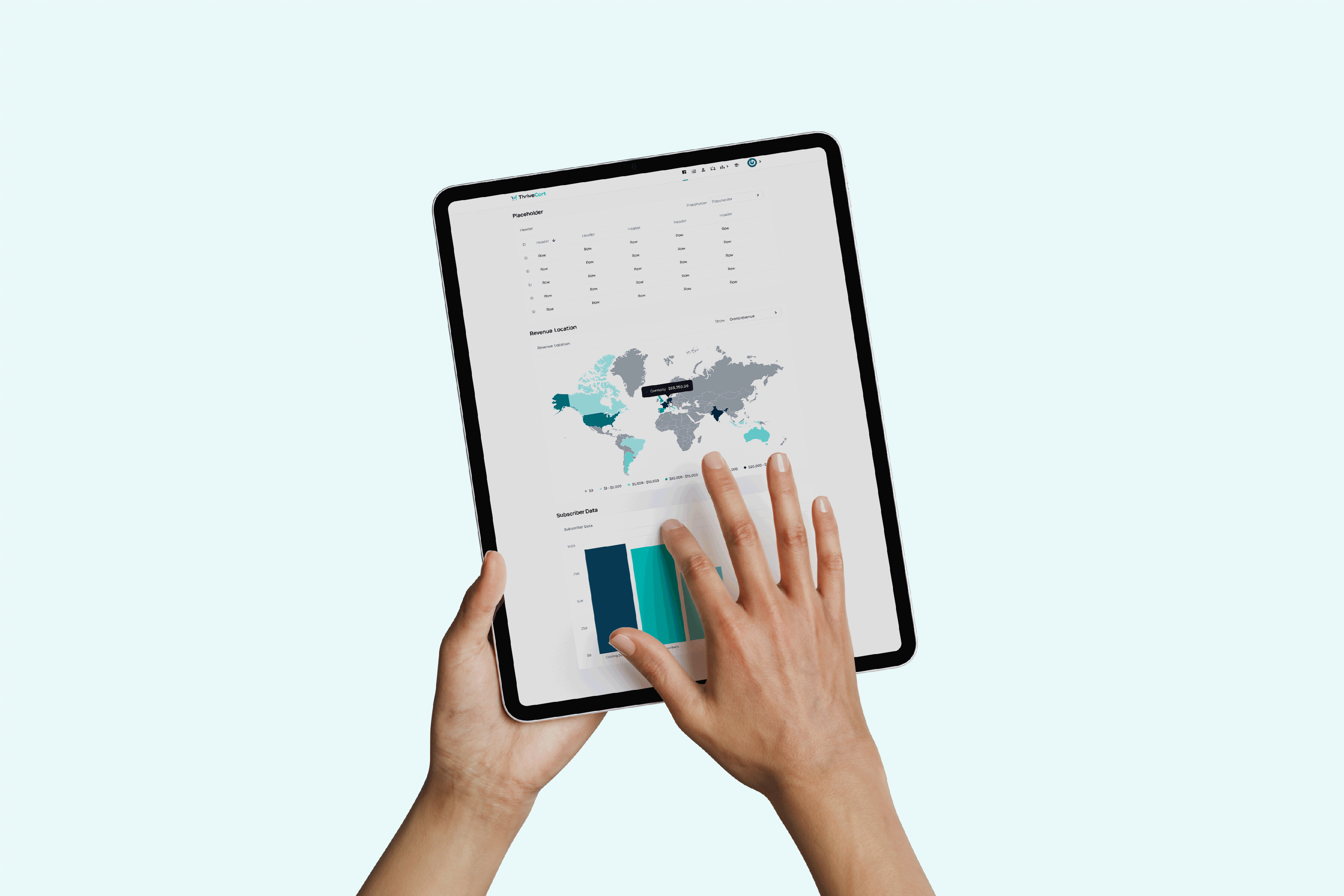
By rethinking how users view data, especially in large quantities, this enabled them to access information with greater ease and clarity. Through a structured and well-considered design system, the information finally behaves.

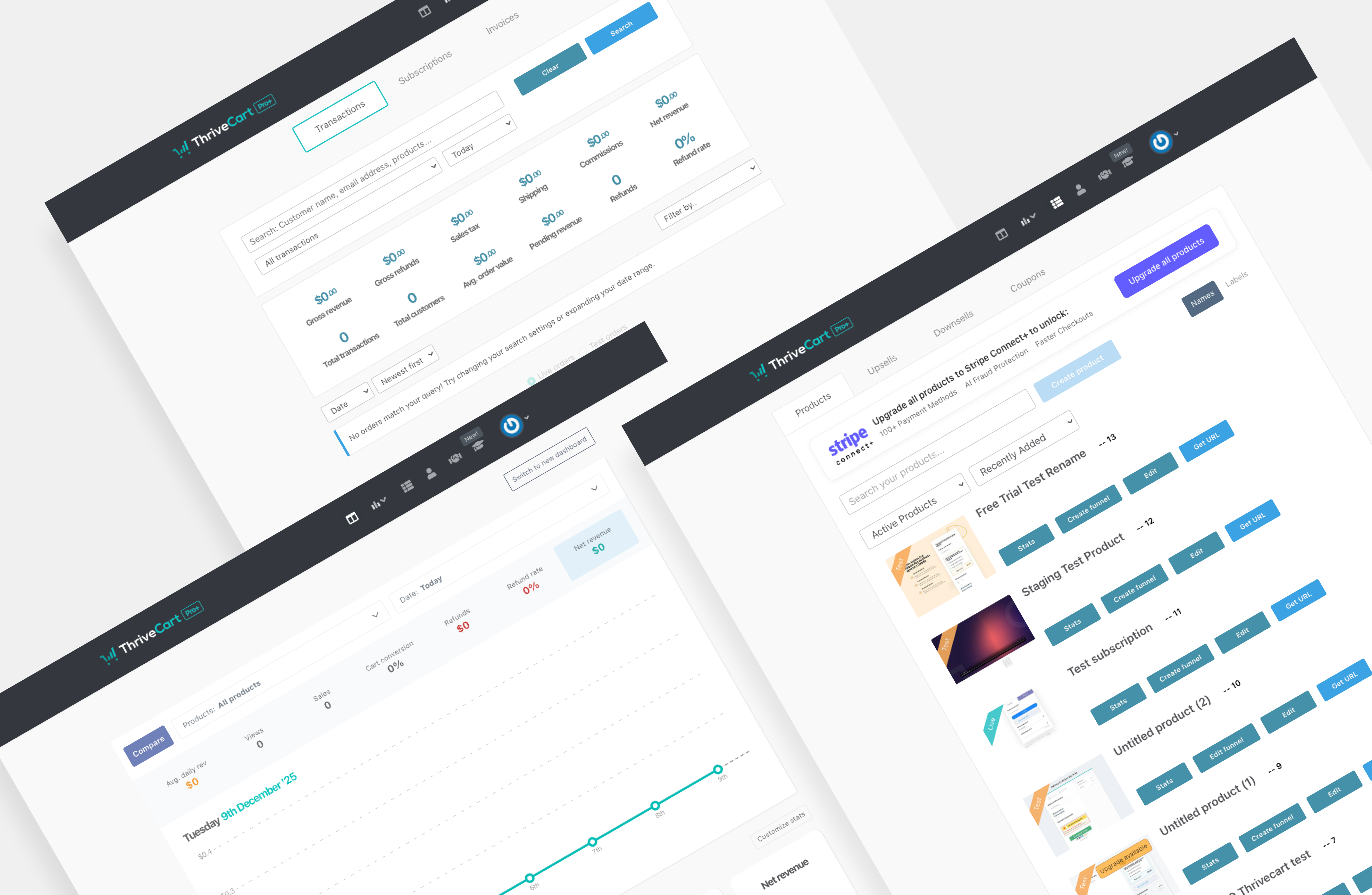
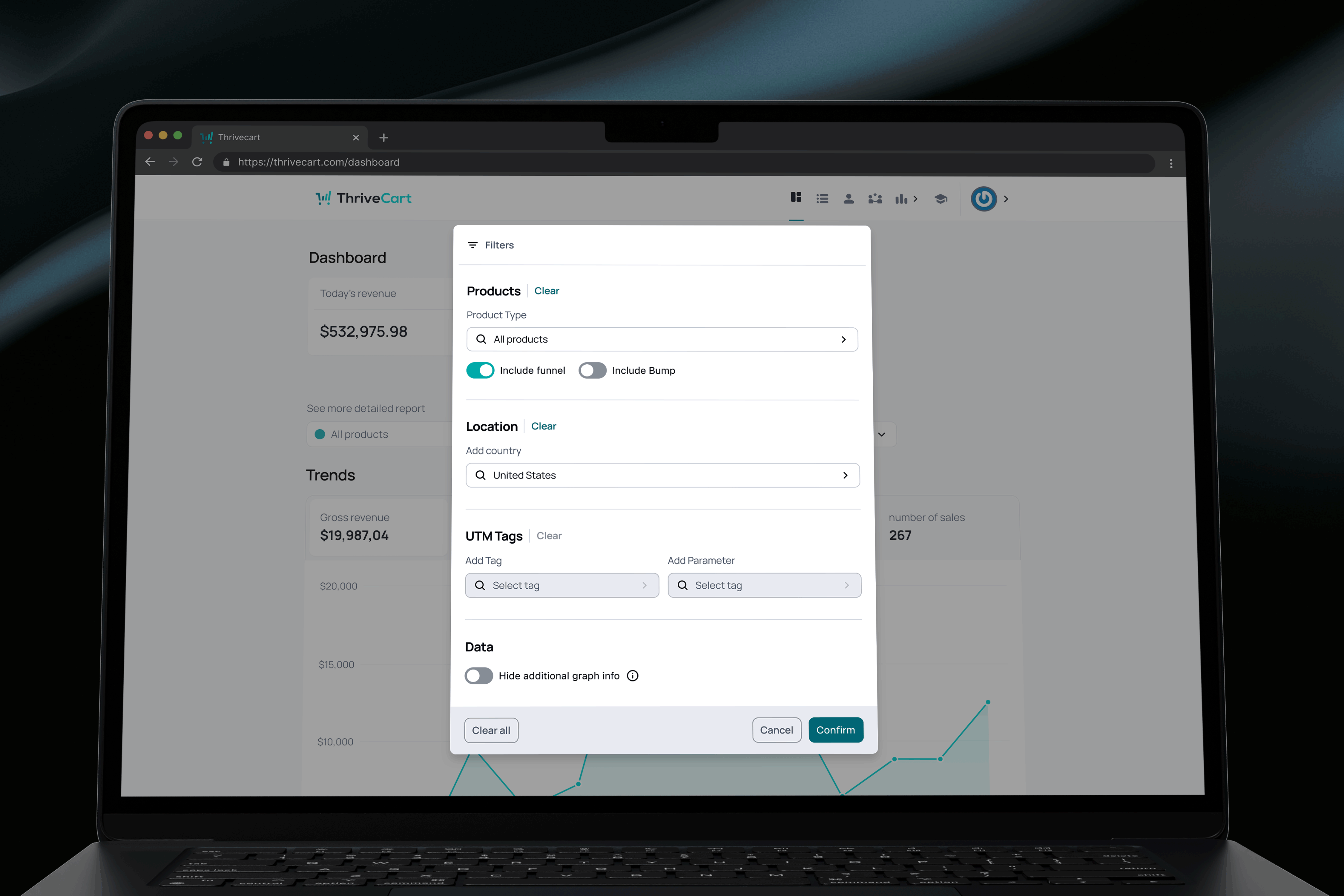
With a structured design system in place, designers were able to explore new layout patterns grounded in usability principles. This opened up more flexible and intuitive ways for users to navigate and interpret their account data.
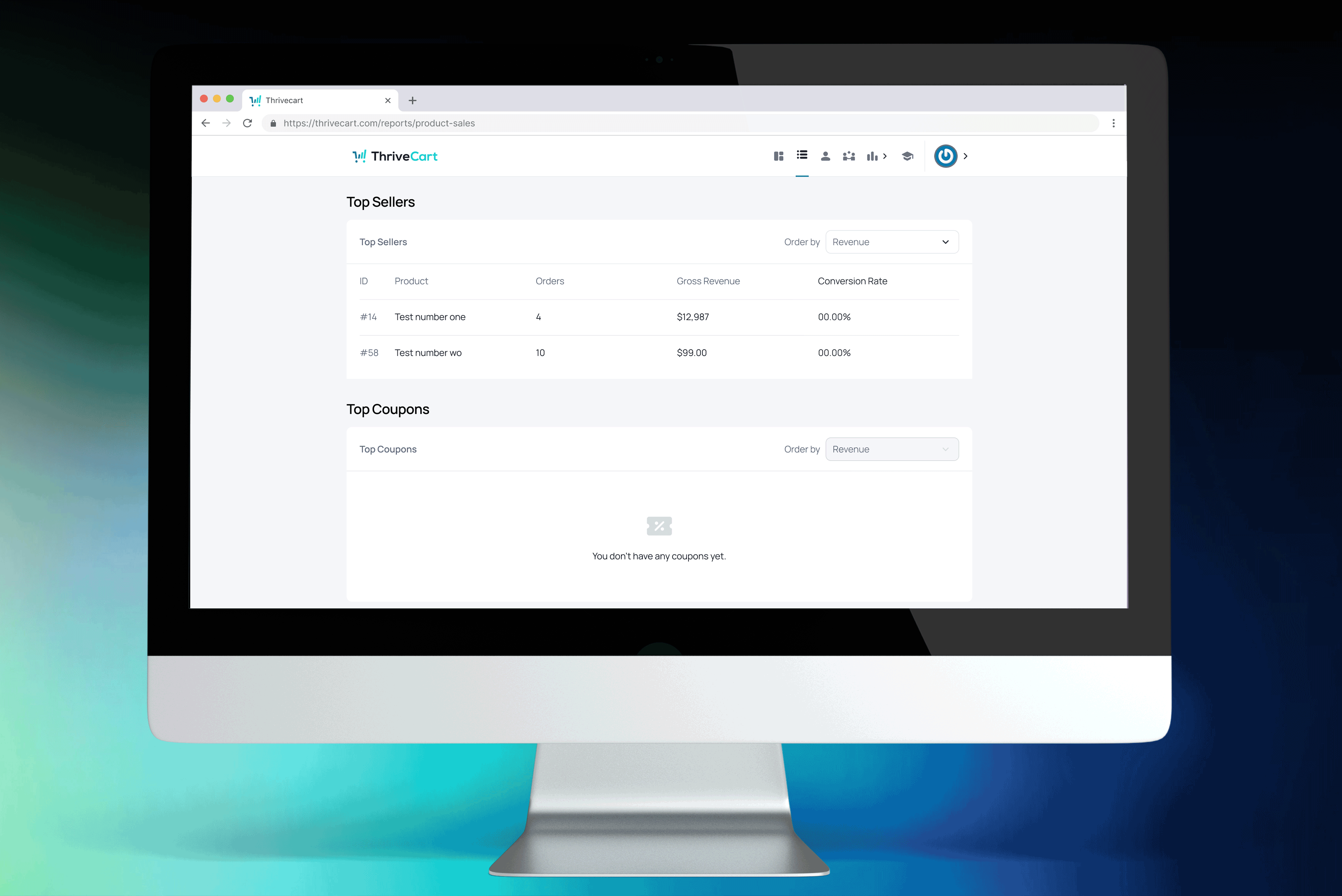
Even on simpler screens, a unified design system strengthened user trust by creating a consistent, predictable experience, while also helping designers and developers work more efficiently.
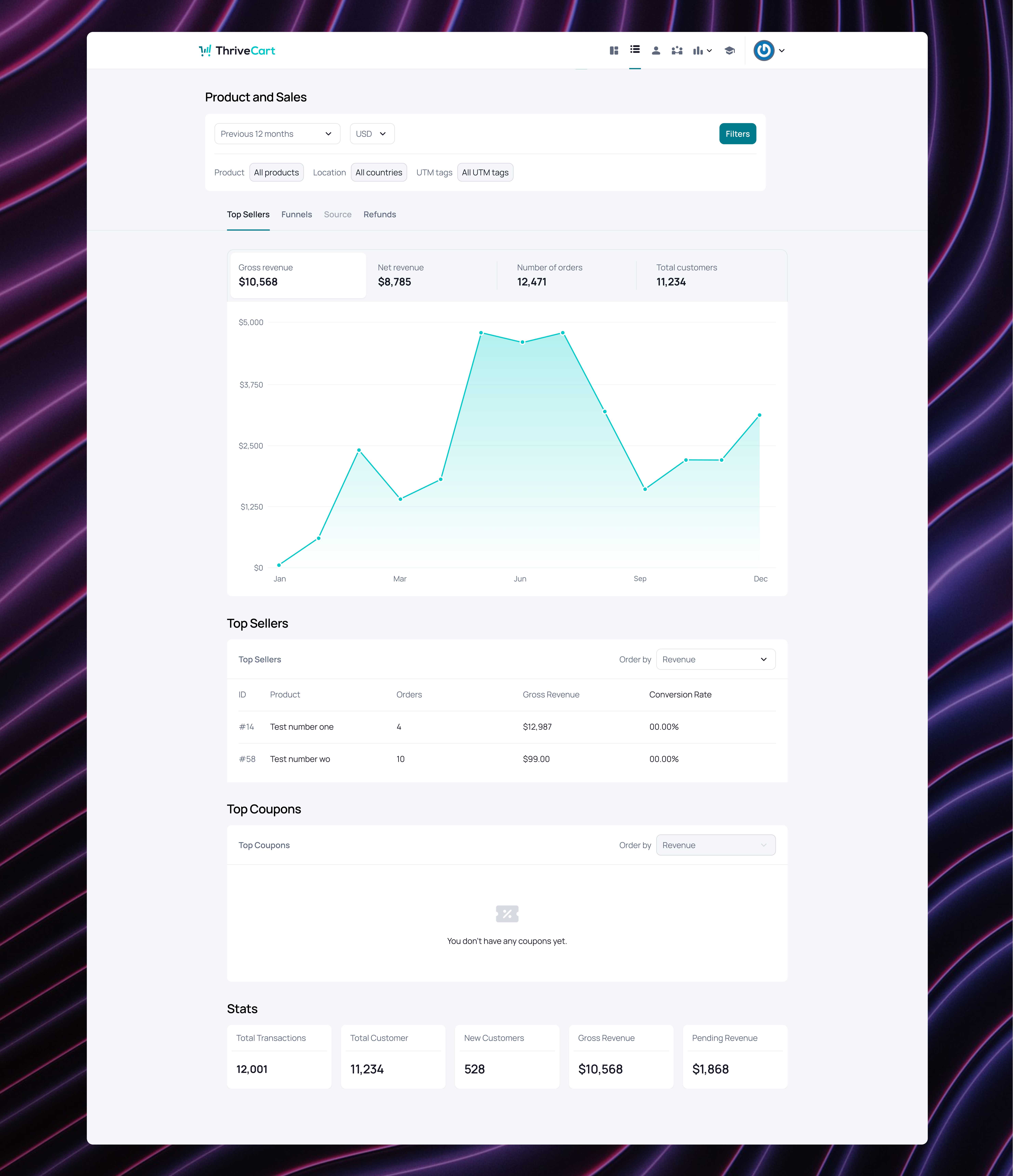
Improving both the UX and visual UI created a more intuitive experience, helping users complete tasks with less effort and feel more confident and satisfied throughout their journey.
Data-intensive screens became easier to scan, actions were more apparent, and information was organised according to a predictable hierarchy. Users could focus on insights rather than navigate interface challenges. Once users learned a pattern in one area, it functioned consistently across the platform, thereby increasing clarity and reducing hesitation.
Design and development teams adopted a shared guide, components, and tokens.
Workflows accelerated, inconsistencies decreased, and new features were produced with greater predictability and significantly improved quality.
The redesign positioned ThriveCart to achieve improvements in critical areas, including:
Reduced cognitive load across dashboards and data views
Faster task completion thanks to clearer hierarchy and simplified interactions
Improved user confidence through consistent patterns and visual clarity
More cohesive, premium product experience
Greater design and development efficiency through a scalable system
Significant reduction in UI inconsistencies across the platform
The interface became more user-friendly, the product achieved greater scalability, and the team was equipped with a system that supported, rather than impeded, their work.

Faster Design Delivery
Reusable components and clear foundations reduced time spent rebuilding UI for each ticket.
Less Design–Dev Rework
Shared patterns and documentation cut down misinterpretation and visual rework.
Feature Consistency
Tokens and component rules ensured new features matched the existing product.
Stronger Design–Engineering Alignment
The design system created a shared understanding of how the UI should work.